The Office Part II: The Smartest Guys In The Room
By Katie Press in Projects Enron
July 12, 2021
Background
In The Office Part 1 I used a fake dataset which was good for what I wanted to demonstrate, but not as interesting as using real data. Text data is pretty fun to work with (at least I think so) and I decided to use the Enron email data for this post (title inspired by the book The Smartest Guys In The Room). This dataset was made publicly available during the Federal investigation into Enron’s accounting/business practices. You can download the original data at the above link, but in its current format it’s not super usable, so I’m going to clean it up first using the tidytext package.
Disclaimer: this post might not be 100% reproducible because of the amount of data and time it takes to process, but further down I will provide a link to the almost tidy dataset that can be used for tidy text analysis. If you’re trying to work with the data and having any issues, just message me and I’ll try to help.
Getting and Cleaning Messy Text Data
First get a list of all the files in the mail directory folder. Using recursive = TRUE will give the paths to all the subfolders, and full.names = TRUE will help to read in the data using map_dfr.
After getting the list, I’m subsetting it to only include one person’s mailbox for the purposes of this example. The very last person in the list has 557 emails to read in, which is not many compared to some of the other employees.
Then I can use map_dfr to read all of the emails into one csv all at one time, using read_delim because I want to use tab instead of comma as the delimiter. Otherwise I’ll be missing some of the data (like the email date). I know that if I read them in as a csv, there will only be one column and all the data will be stored in the rows, so I’m naming the column “data” so that they will all stack on top of each other and I don’t end up with 557 columns. The .id just tells me which file the data came from, which is going to be helpful for cleaning.
files <- list.files(path = "~/Desktop/Rproj/enron/maildir/zufferli-j", recursive = TRUE, full.names = TRUE)

mail_df <- str_subset(files, "zufferli-j") %>%
  map_dfr(
    read_delim,
    delim = "\t",
    col_names = c("data"),
    escape_double = FALSE,
    trim_ws = TRUE,
    .id = "source"
  ) %>%
  filter(!is.na(data))
Clean Header Data
After reviewing the data, I noticed that the message header pretty much always(?) ends with the “X-FileName” row. I’m going to use that to separate the header data and make a tidy dataframe out of it. I’m flagging each row that contains “X-FileName” and using the cumulative sum function to basically make a column that will allow me to filter the email in two parts (message header and body).
If you scroll down in this table you can see where the 0 flag ends and the 1 flag begins to indicate the start of the message body.
mail_df <- mail_df %>%
  mutate(header_flag = ifelse(str_detect(lag(data), "X-FileName:"), 1, 0)) %>%
  mutate(header_flag = replace_na(header_flag, 0)) %>%
  group_by(source) %>%
  mutate(header_flag = cumsum(header_flag)) %>%
  ungroup()
Now I can filter to only include the header info. Some emails have a lot of rows in the header due to CCs and BCCs, so I’m going to use str_extract to make a new column with just the variables I want in my tidy dataset. These will become the new column names.
temp <- mail_df %>%
  filter(header_flag == 0) %>%
  mutate(
     new_col = str_extract(
      data,
      "Message-ID:|Date:|From:|To:|Subject:|Cc:|Bcc:|X-From:|X-To:|X-cc:|X-bcc:|X-Folder:|X-Origin:|X-FileName:"
    )
  )
Tidy the Header Data
Finally, I will filter out any rows that don’t contain info I want to use. I’m also using str_remove to get rid of the new future column names in the data column so the data will be cleaner when it arrives at its final destination. Then I just use pivot_wider to spread out my new_col column to the column names and fill them with the corresponding data cells.
tidy_mail <- temp %>%
  ungroup() %>%
  filter(!is.na(new_col)) %>%
  mutate(data = str_trim(str_remove(data, new_col), side = "both")) %>%
  select(-header_flag) %>%
  pivot_wider(names_from = new_col, values_from = data) %>%
  clean_names()
Now I have a tidy dataset with one row for each email. Each variable is a column and each value is stored in a cell.
Clean The Message Body
Now get all the rows that have message body info, group by source, and summarise the rows containing the message body into a list column. Then the message body column can be added back onto the tidy dataset. The message body text can be cleaned later.
tidy_mail <- mail_df %>%
  filter(header_flag == 1) %>%
  group_by(source) %>%
  summarise(message_body = list(data)) %>%
  right_join(tidy_mail)
I highly recommend you do NOT do this for the full dataset, because it’s a lot of data, takes a long time, and there are a couple of other issues that had to be handled that I’m not covering in this post. Basically what I did was put all of the above code into a function that I passed over the level one mail directories, saving each person’s folder into an .RDS format. I made a couple of adjustments to some problematic files, and then read them all into one dataset using purrr’s map_dfr.
save_mail <- function(name){

name.tosave <- paste0("tidy_mail/" , name, "_tidy.RDS")

df <- str_subset(files, paste0(name)) %>%
  map_dfr(
    read_delim,
    delim = "\t",
    col_names = c("data"),
    escape_double = FALSE,
    trim_ws = TRUE,
    .id = "source"
  ) %>%
  filter(!is.na(data))

df <- df %>%
  mutate(header_flag = ifelse(str_detect(lag(data), "X-FileName:"), 1, 0)) %>%
  mutate(header_flag = replace_na(header_flag, 0)) %>%
  group_by(source) %>%
  mutate(header_flag = cumsum(header_flag)) %>%
  ungroup()

temp <- df %>%
  filter(header_flag == 0) %>%
  mutate(
     new_col = str_extract(
      data,
      "Message-ID:|Date:|From:|To:|Subject:|Cc:|Bcc:|X-From:|X-To:|X-cc:|X-bcc:|X-Folder:|X-Origin:|X-FileName:"
    )
  )

tidy_mail <- temp %>%
  ungroup() %>%
  filter(!is.na(new_col)) %>%
  mutate(data = str_trim(str_remove(data, new_col), side = "both")) %>%
  select(-header_flag) %>%
  pivot_wider(names_from = new_col, values_from = data) %>%
  janitor::clean_names()

tidy_mail <- df %>%
  filter(header_flag == 1) %>%
  group_by(source) %>%
  summarise(message_body = list(data)) %>%
  right_join(tidy_mail)

saveRDS(tidy_mail, name.tosave)

gc()
}

#get paths for the level one folders (one per person)
files2 <-list.files("maildir")

#map to tidy dataframe and save to .RDS format using the save_mail function
map(files2, save_mail)
To save you the trouble of doing all that, I’ve uploaded in the final tidy-ish format dataset here. The message body column is unnested into sentences so that you can perform most tidy text mining operations on it by unnesting the sentences further (into words, n-grams, etc.).
Tidy Text Analysis
Using the sentences dataset, I first filtered out all of the “sentences” (rows) that had no letters (only numbers or special characters, blank spaces). Then unnest to words (one word per row), filter by letters only again, and use anti-join to remove stop words. The stop words dataset is built in to the tidytext package, so you don’t have to do anything special if you have that package loaded, just use it in your code and it will show up. I then did a word count to look for superfluous words that I could exclude to maybe cut down further on the size of the dataset. I filtered out words with special characters, and words with 15 or more letters, since those are usually just long strings of nonsense (forwarded emails, etc.).
tidy_word <- tidy_enron %>%
  unnest_tokens(word, sentence) %>%
  filter(str_detect(word, "[[:alpha:]]")) %>%
  anti_join(stop_words) %>%
  filter(!str_detect(word, "-|_|\\.|:|\\d")) %>%
  filter(str_length(word) < 15) %>%
  select(source, x_origin, message_id, date_clean, word)
This is what the unnested dataset looks like now.
For this part I’ll need the dates, so I’m going to filter out all the dates that aren’t within a reasonable time frame.
tidy_word <- tidy_word %>%
  filter(between(year(date_clean), 1998, 2002)) %>%
  mutate(x_origin = str_to_lower(x_origin))

tidy_word <- tidy_word %>%
  group_by(word) %>%
  mutate(word_total = n()) %>%
  ungroup()

tidy_word <- tidy_word %>%
  mutate(month = floor_date(date_clean, "months"))
There are still some things that could be cleaned up. Some of these acronyms are part of email signatures, I don’t really want names in here, etc. Even though I have a tidy dataframe with one word per row, some of the words are still not usable, which is not a surprise considering this data was semi-structured at best prior to tidying.
The lexicon package has some datasets that might be useful for filtering out words I want to get rid of. For example, common first and last names. I also decided to use the function words dataset, which contains words like “almost” and “between”.
data(freq_first_names)
data(freq_last_names)
data(function_words)
data(key_corporate_social_responsibility)

freq_first_names <- freq_first_names %>%
  mutate(word = str_to_lower(Name))

freq_last_names <- freq_last_names %>%
  mutate(word = str_to_lower(Surname))

function_words <- tibble::enframe(function_words) %>%
  rename("word" = value)
Exclude the words from the tidy_word dataset.
tidy_word <- tidy_word %>%
  anti_join(freq_first_names) %>%
  anti_join(freq_last_names) %>%
  anti_join(function_words)
Get the number of emails sent per month, and word counts by month.
month_count <- tidy_word %>%
  count(message_id, month) %>%
  count(month) %>%
  rename("month_total" = n)
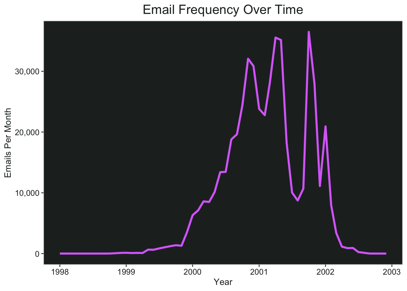
The bulk of the emails are from 2000 through 2002, and I don’t want any months that have really small values in this analysis because it will skew the percentages over time. I’m going to filter down to only months that have 1,000 emails or more, which would be August 1999 through April 2002.
ggplot(month_count, aes(x = month, y = month_total))+
  geom_line(color = pal.9[8], size = 1.2)+
  scale_x_date(name = "Year", date_breaks = "year", date_labels = "%Y")+
  scale_y_continuous(name = "Emails Per Month", labels = scales::comma)+
  ggtitle("Email Frequency Over Time")+
  my_theme
Now I’m filtering by date again, and I’m also filtering so that the word length is five or more characters, because the shorter words are not usually meaningful.
month_count <- month_count %>%
  filter(month %within% ("1999-08-01" %--% "2002-04-01"))

word_month_counts <- tidy_word %>%
  filter(month %within% ("1999-08-01" %--% "2002-04-01")) %>%
  filter(word_total >= 500, str_length(word) > 4) %>%
  count(word, month) %>%
  complete(word, month, fill = list(n = 0)) %>%
  inner_join(month_count, by = "month") %>%
  mutate(percent = n / month_total) %>%
  mutate(year = year(month) + yday(month) / 365)

word_month_counts <- word_month_counts %>%
  filter(percent <= 1)

word_month_counts <- word_month_counts %>%
  filter(!str_detect(word, "font|align|color|image|serif|arial|align|helvetica|padding|link|verdana|fff|space|width|span|spacing|script|servlet|size|email|http"))
The next step is to fit a regression model to see if the word frequency is increasing over time. I got this idea from Variance Explained. However, that example uses news articles and the expected result is that the words increase (somewhat) steadily over time. I’m not necessarily expecting that to happen with the Enron dataset, but there should be at least some spikes of activity around the scandalous events that occurred leading up to Enron’s downfall.
mod <- ~ glm(cbind(n, month_total - n) ~ year, ., family = "binomial")

slopes <- word_month_counts %>%
  group_nest(word) %>%
  mutate(model = map(data, mod)) %>%
  mutate(model = map(model, tidy)) %>%
  select(-data) %>%
  unnest(model) %>%
  filter(term == "year") %>%
  mutate_if(is.numeric, ~round(., 3))
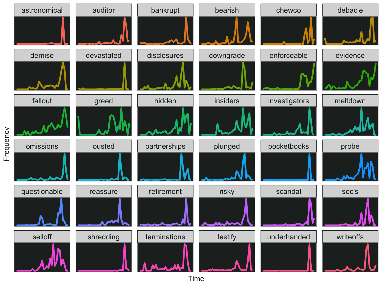
Here are the words that increase over time. Very interesting that “underhanded”, “pocketbooks”, and “shredding” are all on the top of the list. If you scroll a few pages, you’ll also see words like “devastated”, “scandal”, and even “chewco”, which is one of the limited partnerships that Fastow set up to hide Enron’s debt (and led to its downfall).
I searched through the top results in the above dataframe, and picked out a few that might be interesting so I can plot them.
slope.words <- c("underhanded", "shredding", "pocketbooks", "devastated", "astronomical", "scandal", "chewco", "auditor", "partnerships", "enforceable", "sec's", "ousted", "retirement",  "plunged", "writeoffs", "investigators", "bankrupt", "downgrade", "debacle", "omissions", "disclosures", "testify", "reassure", "hidden", "risky", "probe", "insiders", "demise", "terminations", "bearish", "selloff",
                 "questionable", "meltdown", "fallout", "greed", "evidence")

word_month_counts %>%
  filter(word %in% slope.words) %>%
  ggplot(., aes(x = year, y = percent, color = word))+
  geom_line(size=1.2)+
  facet_wrap(~word, scales = "free_y")+
  my_theme+
  theme(axis.text.x = element_blank(),
        axis.text.y = element_blank(),
        axis.ticks = element_blank(),
        axis.title = element_blank())+
  xlab("Time")+
  ylab("Frequency")
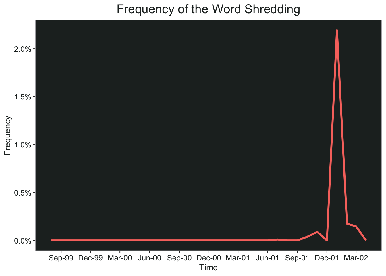
Let’s take a closer look at the word “shredding” since it seems pretty shady. Notice that the huge spike happens in January 2002, right around the time the U.S. Department of Justice announced a criminal investigation of Enron. Of course, the bankruptcy was announced in December 2001, so at first I thought it could be related to that. However, when I checked the word counts by month, there were 25 mentions of “shredding” in November 2001, none in December, and 459 in January 2002.
word_month_counts %>%
  filter(word == "shredding") %>%
  ggplot(., aes(x = month, y = percent, color = word))+
  geom_line(size=1.2)+
  scale_x_date(date_breaks = "3 months", date_labels = "%b-%y")+
  scale_y_continuous(labels = scales::percent_format(accuracy = .1))+
  ggtitle("Frequency of the Word Shredding")+
  my_theme+
  xlab("Time")+
  ylab("Frequency")
 Here’s a fun word cloud of all the words from emails containing the word “shredding”. You can hover over the cloud and it tells you the total for each word.
temp <- tidy_word %>%
  group_by(message_id) %>%
  filter(any(word == "shredding")) %>%
  ungroup() %>%
  count(word) %>%
  rename("freq" = n)

temp2 <- temp %>%
  filter(str_length(word) > 4, freq > 50) %>%
  filter(!str_detect(word, "enron"))
temp2 <- readRDS("/Users/katiepress/Desktop/Rproj/enron/tb6.RDS")
wordcloud2(temp2, color = rep(rev(pal.8), 50000), backgroundColor = "#232928", fontFamily = "Arial", rotateRatio = .5)
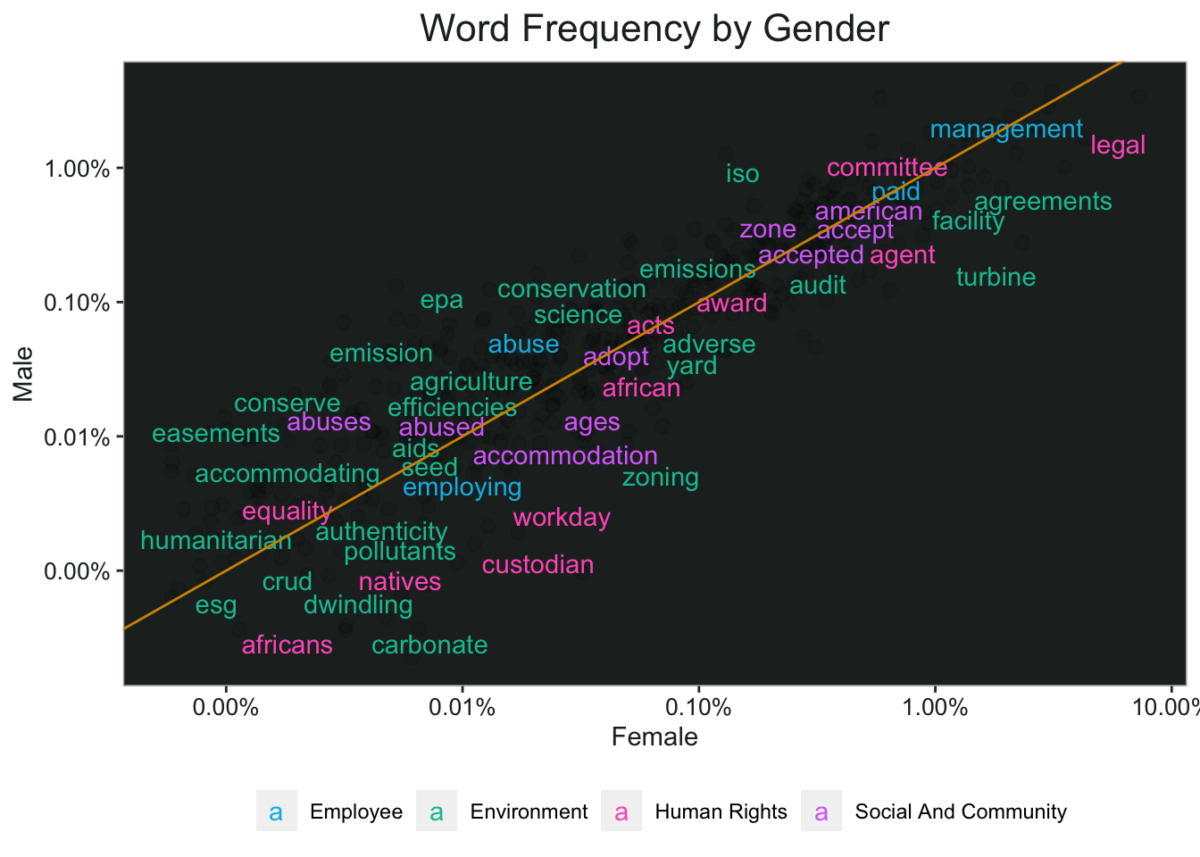
I read an article in Harvard Business Review recently and learned that banks with more women on their boards commit less fraud, which I found fascinating:
The financial institutions with greater female representation on their boards were fined less often and less significantly. We proved both correlation and causation by controlling for many other factors, including the number and dollar amount of fines received the previous year, board size, director tenure, director age, CEO tenure, CEO age, CEO turnover, bank size, banks’ return on equity, and the volatility of the banks’ stock returns. We even controlled for diversity itself. In other words, was the better behavior a function of boards’ being more diverse in general—with members representing a variety of ages, nationalities, and both executives and nonexecutives—rather than because boards had more women? It turns out that gender diversity was what mattered—though I should acknowledge that other types of diversity contribute to fewer or lower fines, too.
You might have noticed the corporate responsibility words dataset I imported earlier. I thought I would use that and see if there are any words that are more likely to come from emails written by women as opposed to male employees.
First I had to clean up the x-origin column, then I made a list of all the women.
tidy_word <- tidy_word %>%
  mutate(x_origin = replace(x_origin, x_origin == "lavorado-j", "lavorato-j"),
         x_origin = replace(x_origin, x_origin == "baughman-e", "baughman-d"),
         x_origin = replace(x_origin, x_origin == "luchi-p", "lucci-p"),
         x_origin = replace(x_origin, x_origin == "mims-p", "mims-thurston-p"),
         x_origin = replace(x_origin, x_origin %in% c("weldon-v", "wheldon-c"), "weldon-c"),
         x_origin = replace(x_origin, x_origin == "williams-b", "williams-w3"),
         x_origin = replace(x_origin, x_origin == "zufferlie-j", "zufferli-j"))

women.list <- c("bailey-s", "beck-s", "blair-l", "brawner-s", "cash-m",
                "causholli-m", "corman-s", "davis-d", "dickson-s", "fischer-m",
                "gang-l", "geaccone-t", "heard-m", "jones-t", "kitchen-l",
                "kuykendall-t", "lavorato-j", "lokay-m", "mann-k",
                "mims-thurston-p", "panus-s", "pereira-s", "perlingiere-d",
                "ring-a", "sager-e", "sanchez-m", "scholtes-d", "scott-s",
                "semperger-c", "shackleton-s", "smith-g", "staab-t", "symes-k",
                "taylor-l", "tholt-j", "townsend-j", "ward-k", "watson-k", "white-s")
I also pulled the message IDs that are specifically from “sent mail” folders to try and ensure that most of the emails would be written by the original owner of the folder. I made a column for gender, and then filtered so that only the words from the corporate social responsibility dataset are included.
The corporate social responsibility words are grouped by four different dimensions, and some words can be in multiple dimensions. However, since the words had the same count no matter which dimension they belong to, I didn’t want to represent them twice in my final chart, so I just selected a random dimension for each word that belonged to more than one.
word_counts <- tidy_word %>%
  mutate(gender = ifelse(x_origin %in% women.list, "Female", "Male")) %>%
  filter(message_id %in% sent.ids) %>%
  filter(word %in% key_corporate_social_responsibility$token) %>%
  group_by(gender) %>%
  mutate(gender_total = n()) %>%
  count(gender, word, gender_total) %>%
  mutate(pct = n/gender_total)

word_freq <- word_counts %>%
  select(gender, word, pct) %>%
  pivot_wider(names_from = gender, values_from = pct)

word_freq <- word_freq %>%
  left_join(key_corporate_social_responsibility %>%
              group_by(token) %>%
              sample_n(1) %>%
              select("word" = token, dimension)) %>%
  mutate(dimension = str_to_title(str_replace_all(dimension, "_", " ")))
In the chart below, words that are closer to the diagonal line are used more equally by men and women. Words that appear on the top of the line are more frequently attributed to men, and women on the bottom of the line. This result looks to me like women use social responsibility words more frequently than men, since there are more words on the bottom. It also looks like the words that are used more frequently by men are usually in the environmental dimension (green), while women use more of the words from the other three dimensions.
ggplot(word_freq, aes(Female, Male)) +
  geom_jitter(alpha = 0.1, size = 2.5, width = 0.25, height = 0.25) +
  geom_text(aes(label = word, color = dimension), check_overlap = TRUE, vjust = 1.5) +
  scale_color_manual(values = c(pal.9[6], pal.9[5], pal.9[9], pal.9[8]))+
  scale_x_log10(labels = scales::percent_format(accuracy = .01)) +
  scale_y_log10(labels = scales::percent_format(accuracy = .01)) +
  geom_abline(color = pal.9[2])+
  ggtitle("Word Frequency by Gender")+
  my_theme+
  theme(legend.position = "bottom",
        legend.title = element_blank())
That’s all for now…let me know what you think.