The Office Part III: 37 Pieces of Flair
By Katie Press in Projects Enron
July 30, 2022
Adventures at rstudio::conf(2022)
Click here to go straight to the network plots
Over the past few days I’ve been fortunate enough to attend the rstudio::conf(2022). It was so great to be around so many other R users, and just data science people in general. I also attended the first ever R for People Analytics 2-day workshop led by Keith McNulty and his team from McKinsey. It was a great opportunity for me, since I just started a new job on the People Analytics team at Elastic. Plus, I’ve experimented very briefly with network analysis and I think it’s really interesting, so it was great to get a more thorough introduction to those concepts.
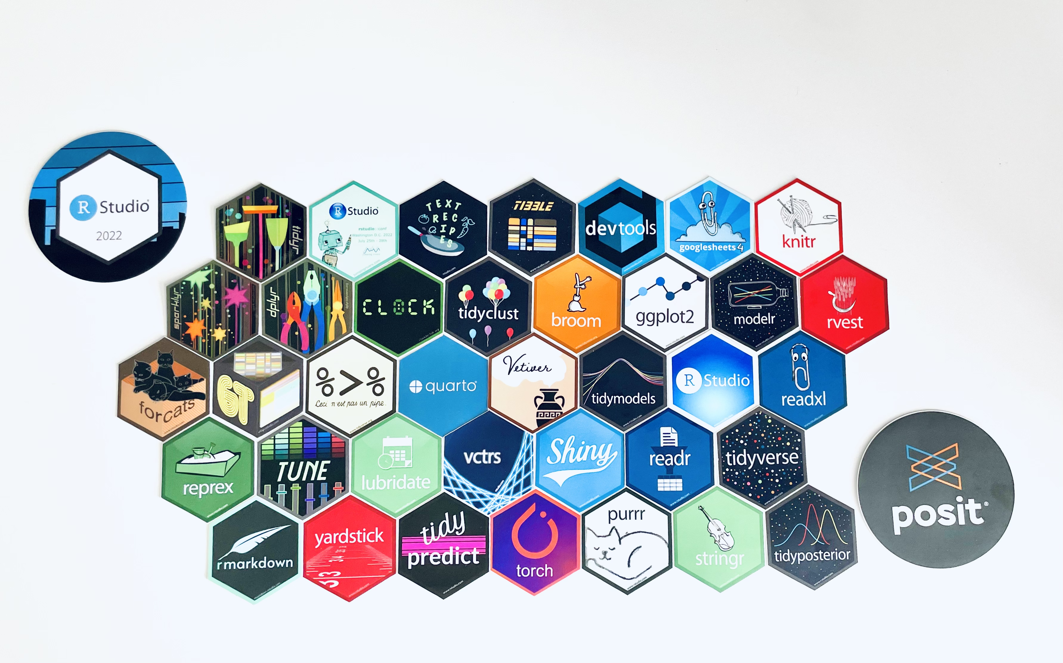
One of my favorite things about the RStudio conference was the stickers, of course! Finding specific stickers, trading them with other people, getting brand new stickers from new package releases (tidyclust!!). I also collected some pins for my lanyard, and there were more than a few Office Space jokes with other attendees.
| I felt like I didn’t have enough flair. | I was half expecting this guy to show up! |
|---|---|
 |
 |
I did have trouble finding some of the pins I wanted. But when I got home from the conference, I realized I had collected exactly 37 hex stickers, not counting the super special round stickers we got because RStudio is rebranding to Posit!
I meant to get this post up yesterday, but I was still recovering from my series of misadventures trying to get home from the conference. My two-hour return journey turned into about a 10-hour trip, which included several hours in a very loud, Blake Shelton-themed restaurant in the Nashville airport. Thankfully I made it back to Madison eventually, even if it was 1 AM.
Learning about Network Analysis
Back to your regularly-scheduled analytics blog. We spent the entire second day of the R for People Analytics workshop going over graph theory and network analysis. Network analysis isn’t only used in the people analytics field, it has many applications. But there are some very natural applications to people analytics as well. For example, these questions were posed during the workshop:
- Do differences in connectivity in the network relate to office-level turnover?
- How does the size of different workgroups impact their overall performance?
- Does your finance department share information with your HR department?
You can learn all about this in the materials which Keith and his team generously made available for free to the public on Github.
We had example data to work with during the workshop, but I really wanted to apply these concepts to a real-world dataset. Thankfully I already had the perfect dataset available from one of my older blog posts about cleaning the Enron email corpus. These are real emails that were made public as part of the Federal investigations/lawsuits related to Enron’s demise in the early 2000s. Normally, email data like this would be very hard to come by because of privacy concerns. And in fact, some of the employees in this dataset had to petition to get emails removed from the record that contained personal information.
Read in and Check the Data
The dataset I had prepared for that older blog post is huge, mostly because it was unnested in long format intended for text analysis. I did some cleaning and pre-processing so that the data looked more like the data I was using during the workshop. And you can access those datasets on Kaggle here, or GitHub (links in the code chunk below). One thing to note- this is a subset of emails between a group of Enron employees. The demographic information is from this dataset I found on Github.
enron_edges <- read_csv("https://raw.githubusercontent.com/katiepress/TidyTuesday/main/enron_edges.csv")

enron_vertices <- read_csv("https://raw.githubusercontent.com/katiepress/TidyTuesday/main/enron_vertices.csv")
You may be wondering what kind of data you need to do network analysis. Basically, you need the connections between people (or whatever you’re analyzing), and you can also add other information, like demographics. So here’s what my connections look like - and this is called an edge set in network analysis. One column has the name of the sender, and the second column has the name of the recipient. The same name could be either, or both columns. The “weight” column here is simply the number of emails that occurred between the two people on each row. Andrea Ring only emailed Gerald Nemec one time, but she emailed Richard Ring 90 times.
enron_edges |> head() |> knitr::kable()
| name_from | name_to | weight |
|---|---|---|
| Andrea Ring | Gerald Nemec | 1 |
| Andrea Ring | Richard Ring | 90 |
| Andrea Ring | Sandra F. Brawner | 39 |
| Andrea Ring | Scott Neal | 4 |
| Andrew H. Lewis | Hunter S. Shively | 4 |
| Andrew H. Lewis | Matthew Lenhart | 4 |
And here is the vertices dataset. This time, we have one row per person, and then the columns department through level are describing that particular person. Phillip K. Allen is in Trading, he works for ENA Gas West, and he’s a manager or managing director, and senior level.
enron_vertices |> head() |> knitr::kable()
| name | department | department_desc | title | gender | level |
|---|---|---|---|---|---|
| Phillip K. Allen | Trading | ENA Gas West | Mng Dir Trading | Male | Senior |
| John Arnold | Trading | ENA Gas Financial | VP Trading | Male | Senior |
| Harry Arora | Trading | ENA East Power | VP Trading | Male | Senior |
| Robert Badeer | Trading | ENA West Power | Mgr Trading | Male | Junior |
| Susan Bailey | Legal | ENA Legal | Specialist Legal | Female | Junior |
| Eric Bass | Trading | ENA Gas Texas | Trader | Male | Junior |
Creating the Network
Using the igraph package, I can create a graph object from a dataframe - or rather two dataframes, the edges and vertices. I could still create the graph if I only had the edges, it just wouldn’t contain the demographic data. Because I’m including a vertices dataset, I’ll be able to use the demographic information in my analysis. Below you can see the structure of the graph.
(enron_graph <- graph_from_data_frame(
  enron_edges,
  vertices = enron_vertices,
  directed = FALSE
))
## IGRAPH 338c991 UNW- 145 1423 --
## + attr: name (v/c), department (v/c), department_desc (v/c), title
## | (v/c), gender (v/c), level (v/c), weight (e/n)
## + edges from 338c991 (vertex names):
##  [1] Gerald Nemec        --Andrea Ring
##  [2] Andrea Ring         --Richard Ring
##  [3] Sandra F. Brawner   --Andrea Ring
##  [4] Scott Neal          --Andrea Ring
##  [5] Andrew H. Lewis     --Hunter S. Shively
##  [6] Matthew Lenhart     --Andrew H. Lewis
##  [7] Errol McLaughlin Jr.--Andy Zipper
## + ... omitted several edges
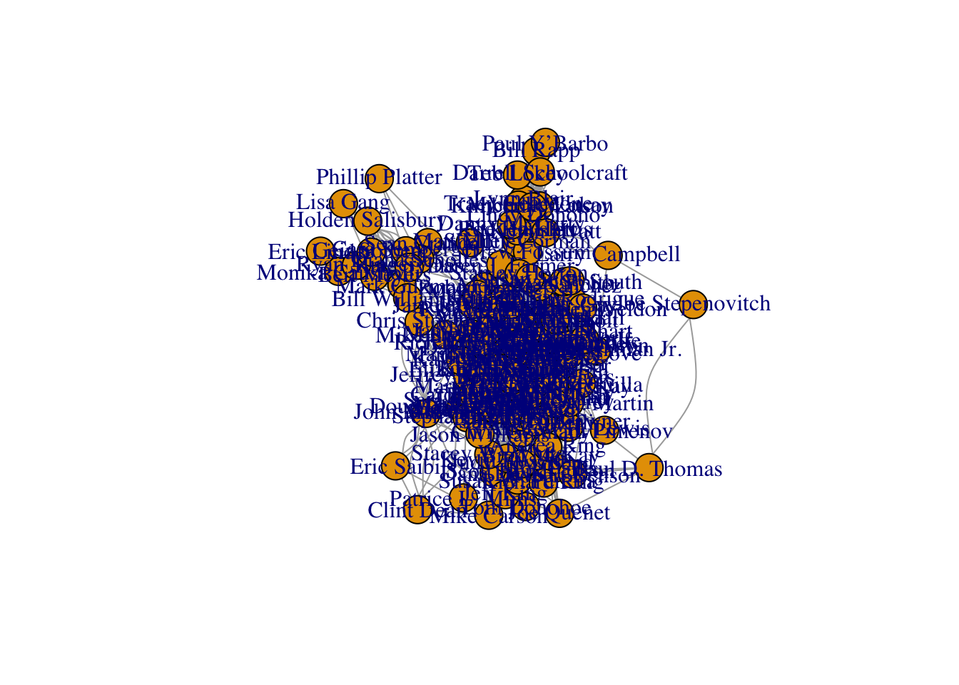
What does the network look like? Not much, as it turns out - and base R plotting might be quick and easy, but it is not exactly pretty. That’s okay though, I’ll make a better plot later on.
set.seed(123)
plot(enron_graph)
Centrality
I apparently have a lot more studying to do before I fully understand graph theory, but I think it’s really cool that I can calculate out all of these measures from my network to use in my analysis. I mean, technically R is calculating it for me, but still. What is centrality, anyways? According to the tidygraph package:
“The centrality of a node measures the importance of node in the network. As the concept of importance is ill-defined and dependent on the network and the questions under consideration, many centrality measures exist.”
Okay, so it really depends on your network and the type of data you’re using. If you look at “centrality” in the tidygraph documentation, there are probably 10-15 different centrality measures available. The measures we discussed in the R for People Analytics were degree centrality, betweenness centrality, and closeness centrality. And according to iGraph…
-
“The degree of a vertex is its most basic structural property, the number of its adjacent edges.”
-
“The vertex and edge betweenness are (roughly) defined by the number of geodesics (shortest paths) going through a vertex or an edge.”
-
“Closeness centrality measures how many steps is required to access every other vertex from a given vertex.”
To calculate centrality, I’m relying on the code we used in the workshop here, because I want to make sure this works with my data before moving on to any other measures. First I can use tidygraph to make a tidy dataframe of a simplified version of my Enron graph. Simplifying the graph just means that I’m getting rid of loops and multiple edges, some of which you can actually see on the base plot above, despite its messiness.
enron_graph_tidy <- simplify(enron_graph) |>
  tidygraph::as_tbl_graph()
Now that I have the tidy version of the graph, I can calculate some centrality measures. Note that any existing weight attribute in the graph will be used by default, but you can turn this off if needed.
centrality_df <- enron_graph_tidy |>
  rename(NODE = name) |>
  mutate(
    degree = tidygraph::centrality_degree(),
    between = tidygraph::centrality_betweenness(),
    closeness = tidygraph::centrality_closeness()
  )
Here are the top 10 most connected people in the network if I arrange by betweenness centrality scores. It appears that Susan Scott is our most connected person. The 10th person in line, Jeff Dasovitch, has basically half the centrality score compared to Susan. This information could be used for any number of things, from identifying high performers, to identifying bottlenecks within the network. For example, if person X is the only person connecting us to persons Y and Z, that position could be critical to keep information or business processes going between departments. And what happens if person X leaves the network? Someone else needs to fill that spot right away, or Y and Z need to become more social.
| name | degree | between | closeness |
|---|---|---|---|
| Susan Scott | 26 | 620.558 | 0.003 |
| Mike Grigsby | 36 | 571.003 | 0.004 |
| Kim S. Ward | 21 | 567.978 | 0.003 |
| Bill Williams III | 17 | 542.302 | 0.003 |
| Louise Kitchen | 41 | 469.343 | 0.004 |
| Phillip K. Allen | 31 | 464.545 | 0.004 |
| Chris Germany | 22 | 421.120 | 0.003 |
| Scott Neal | 31 | 416.604 | 0.003 |
| Kay Mann | 19 | 383.089 | 0.003 |
| Jeff Dasovich | 22 | 364.606 | 0.003 |
Community Detection
One of my favorite parts of the workshop was learning about this concept of “community detection”. I think it’s fascinating that we can use computers to identify patterns that are undetectable to humans. In fact, I’ve used these concepts in my work many times, for example - in latent profile analysis or latent dirichlet allocation with text data. So I was pretty psyched to learn that I can make similar discoveries using networks! There are a few different algorithms you could use for community detection. The one I will use here is called the louvain clustering algorithm.
From what I understand, the algorithm assigns all vertices to their own communities. Then, the algorithm keeps reassigning vertices to different communities based on the vertex’s optimal contribution to that community. All vertices are continuously reassigned to communities until their modularity optimization is maxed out. Then, it repeats the same process with the resulting communities, so it treats each community like a vertex and tries to see if the modularity is optimized by combining certain communities. The resulting communities will have different characteristics, some will be larger, some will have fewer people, etc.
Let’s see how many communities are in that messy network that I first plotted using base R. First, I will get the clusters using the algorithm, making sure to set a seed to control the randomization so I don’t keep getting different results every time I run this code! After I get the results of the clusters, I can add them to the vertices of the graph as a feature to use later.
set.seed(123)

communities <- cluster_louvain(enron_graph)

V(enron_graph)$community <- membership(communities)
I can check how many communities the algorithm detected, and how many people are in each community. In this case, there are nine different communities. The smallest community has six members and the largest has 34 members.
sizes(communities)
## Community sizes
##  1  2  3  4  5  6  7  8  9
## 20 34  8  8 21 15  6 20 13
Because these are communities of people, and I know there are various departments, titles, and positions in the data, I’m really interested to see what each community has in common, and how the communities differ from each other. I can pull the names and community numbers out of the communities object, and then add the demographic data from the vertices.
community_df <- bind_cols(
  community = communities$membership,
  name = communities$names
) |> inner_join(enron_vertices)
I can also add the centrality measures, because remember those were calculated for each person.
community_df <- centrality_df |>
  mutate_if(is.numeric, ~round(., 3)) |>
  as_tibble() |>
  select(name = NODE, degree:closeness) |>
  inner_join(community_df)
This table shows the most connected person per community. You’ll notice that Susan Scott, our all-star of centrality, is the most important/connected person for community #5. The only person who is on this list, and not in our previous top 10 list, is Tana Jones. That’s pretty interesting. Not only are these people in the top 10 of the entire network, they each seem to be leading a particular community.
| name | degree | between | closeness | community |
|---|---|---|---|---|
| Mike Grigsby | 36 | 571.003 | 0.004 | 1 |
| Louise Kitchen | 41 | 469.343 | 0.004 | 2 |
| Jeff Dasovich | 22 | 364.606 | 0.003 | 3 |
| Tana Jones | 27 | 277.244 | 0.003 | 4 |
| Susan Scott | 26 | 620.558 | 0.003 | 5 |
| Chris Germany | 22 | 421.120 | 0.003 | 6 |
| Kay Mann | 19 | 383.089 | 0.003 | 7 |
| Bill Williams III | 17 | 542.302 | 0.003 | 8 |
| Kim S. Ward | 21 | 567.978 | 0.003 | 9 |
Plotting Community Differences
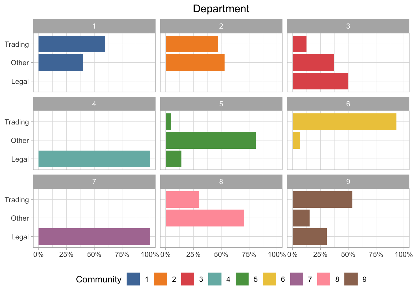
I decided to plot a few of the demographic elements so that I can easily visualize the differences between the nine communities. I did end up leaving out the “title” variable from this analysis just because that data is a bit messy and the resulting plot wasn’t very helpful.
Department Group
I called this field “department” in the data, but it’s really more of an overall grouping. So we have trading, legal, and “other”, which could be any number of things. If we look at the communities by department group, there are some pretty obvious differences. For example, communities 4 and 7 are all in the legal group, but community 6 is almost entirely trading.
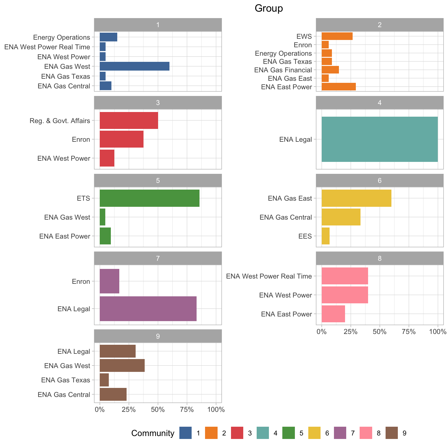
Department Description
I also have these detailed department descriptions. I think it’s quite interesting that communities 4 and 7 both have mostly ENA Legal people, but they are grouped separately. Also it looks like those legal people in community 3 are all in Regulatory & Government Affairs. It also looks like the “gas” departments are more likely to be grouped together (communities 6 and 9), and the “power” departments in community 8. It seems like the type of energy are more important for the groupings than physical location in most cases.
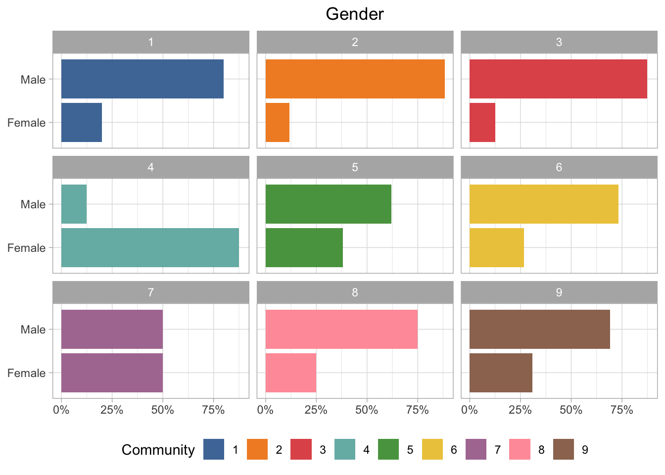
Gender
Almost all of the communities are majority male, except for community 4, which is majority female. And of course community 7 is 50/50.
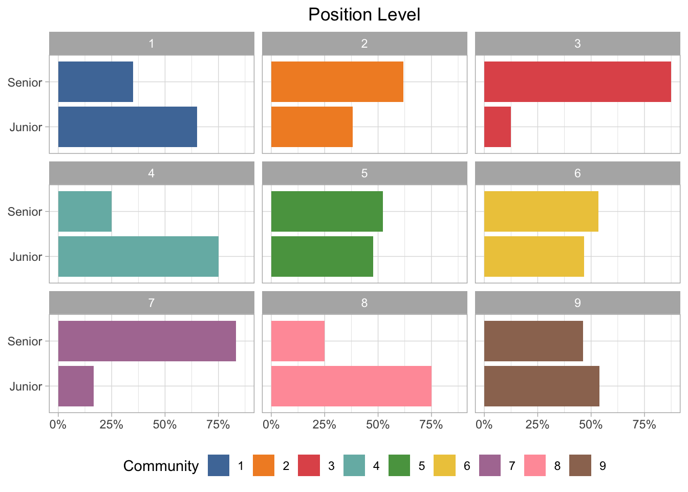
Position Level
This dataset is supposed to be executives, so I’m not sure how accurate this is, but the groups are more balanced between junior and senior positions than I would expect. Community 3 and 7 are definitely more senior, but several of the groups are nearly an even split between junior and senior employees.
Plotting the Network with D3
First I need to great an igraph object that can be plotted with the networkD3 package. I will use the communities as the group so that the colors will be mapped to community.
enron_d3 <- igraph_to_networkD3(enron_graph,
                                group = V(enron_graph)$community)
I also want to highlight the most important person in each community based on the centrality measures. I would have liked to either start the visualization with these nodes highlighted, or make it so their names are always visible (not just when you click on them). I’m not super familiar with the networkD3 package or D3 plots in general, so I ended up just mapping it to the node size attribute. To do that I had to manually add it to the node dataset within the enron_d3 object I created in the above chunk.
enron_d3$nodes$map_size <-
  ifelse(
    enron_d3$nodes$name %in% c(
      "Mike Grigsby",
      "Louise Kitchen",
      "Jeff Dasovich",
      "Tana Jones",
      "Susan Scott",
      "Chris Germany",
      "Kay Mann",
      "Bill Williams III",
      "Kim S. Ward"
    ),
    15,
    1
  )
And finally…the interactive network plot! Based on the colors, it looks like most of the communities are clustered fairly closely together. What’s really interesting to me is that a few of them are quite distant from the other communities - for example, 5 and 8 stand out. Community 1 is also sort of standoffish all the way up at the top of the plot.
As for the most central individuals, their characteristics vary quite a bit. If you click on Bill Williams III (the largest pink circle), you’ll see that he is really connected - but only to his specific community. He only has two connections to people outside his community, one of those being Kay Mann - who seems to be connected to people from lots of different communities. And if you click on the centrality all-star, Susan Scott (the large green circle), it appears that she connects two completely separate communities from all the way across the network (communities 1 and 5).
set.seed(123)
networkD3::forceNetwork(Links = enron_d3$links,
                        Nodes = enron_d3$nodes,
                        NodeID = "name",
                        Source = "source",
                        #Value = "value",
                        Nodesize = "map_size",
                        Target = "target",
                        Group = "group",
                        fontSize = 18,
                        colourScale = JS("d3.scaleOrdinal([`#4e79a7`, `#f28e2c`, `#e15759`,
                        `#76b7b2`, `#59a14f`, `#edc949`,
                        `#af7aa1`, `#ff9da7`, `#9c755f`]);"),
                        linkColour = "lightgray",
                        opacity = 0.9,
                        bounded = TRUE,
                        legend = TRUE)
The plot below is what it looks like if I turn on the weight attribute, which is confusingly named “Value” in this function (you can see I commented that out in the first plot). Now all the edges are different widths depending on the number of emails sent/received between those two people. It does make the plot a bit harder to read though. But you can still hover over the points, click on them, and drag them around.
I do really like the interactivity of these plots, and they look pretty good too. I just wish it was a bit easier to figure out how to make changes to the defaults.
Sidenote: I almost did this blog post in Quarto - I actually got it working but couldn’t figure out how to make the syntax highlighting/styling the same as the rest of my blog. But I was really impressed with Quarto and all the cool features I saw during the keynote and other talks at the conference. The biggest thing for me is the ease of creating multilingual documents and websites—this would be really useful for posts where I’m using Python or Julia. So, I’m strongly considering moving to Quarto, but I’ll have to see if I can work out a format that I’m happy with.
That’s all for now…see you at posit::conf(2023)!
- Posted on:
- July 30, 2022
- Length:
- 17 minute read, 3510 words