Analytics X3: Tidy Tuesday US Solar
By Katie Press in Analytics X3 TidyTuesday
May 6, 2022
Introducing Analytics Three Ways (AX3)
I love the show Top Chef, and I’ve been watching it for years. One funny thing I’ve noticed is that whenever one of the chefs tries to make a dish too fancy by presenting it in different ways (e.g., “grilled cheese three ways”), it usually ends in disaster. Or, one of the grilled cheese preparations is delicious, and one is some weird kind of deconstructed thing with foam on it that doesn’t taste good at all. The important lesson here is that it’s better to do one thing you’re good at than doing multiple things you’re mediocre (or bad) at.
So, naturally I’ve decided to ignore this advice completely. I have been using R for years almost on a daily basis, so I’m quite comfortable with it. But lately I’ve been experimenting with some other languages, trying to learn the syntactical differences as well as the benefits and drawbacks to each one in comparison with R. I decided to use the Tidy Tuesday challenges to practice these skills, specifically in Python and Julia (at least for now). I’m just going to add a blanket disclaimer here that applies to all future AX3 posts, which is that I am not an expert in either Python OR Julia, and my analyses in these languages might not be ideal so please be nice if you have comments or suggestions.
I’m still deciding on how to best share the Python and Julia scripts. If I shared all the code in Rmarkdown it might get really long, so for now I’ll probably sprinkle in a little bit here and there. You can find my code on Github and/or Kaggle:
- Rmarkdown Analysis
- Python Analysis in Jupyter Notebook on Kaggle
- Julia Analysis in Jupyter Notebook on Github
I will do my best to keep the structure of the code very similar between the three files, and with operations in the same order. Also just FYI, I’ve been using VSCode for Python/Julia and still using RStudio for R.
Data Overview
This week’s Tidy Tuesday data is from Berkeley Lab’s “Utility-Scale Solar 2021 Edition”. I downloaded the data from the Tidy Tuesday Github repo but, as usual, got distracted by all the other information I found about the data online. I found this Tableau Dashboard and I really like how it looks (especially the bubble chart), so I decided to try and recreate it using ggplot2.
I went to the original Excel file for the Tidy Tuesday data and figured out which tabs held the data to create the dashboard visualizations. I used the readxl package to read in the data and then saved it out as a csv file to use in my Julia and Python analyses. I’ve also uploaded the ppa_price csv to Kaggle. This is the data in original format, so you can use it to import at the beginning of the file if you’re following along with one of the scripts, just change the file path to wherever you’re storing it.
ppa_price <- read_excel(
  "/Users/katiepress/Desktop/Rproj/Tidy Tuesday/2021_utility-scale_solar_data_update_0.xlsm",
  sheet = "PPA Price by Project (PV only)",
  range = "A24:L357"
)
#write_csv(ppa_price, file = "ppa_price.csv")
Data Analysis
This analysis has a few main components that are commonly needed no matter which programming language you’re using, such as:
- Reading in and examining the data
- Converting data from wide to long
- Creating new variables, changing data types
- Dealing with date-time formatting
- Plotting
I wanted to use the programs’ native plotting mechanisms (or close to them), so tried as best I could to create plots in python Seaborn and Julia’s default gr() plotting backend, and it didn’t go so well. I ended up having to use Plotly for both Python and Julia, and I’ve used Plotly with R in the past so it was a little bit easier to figure out. However, I use ggplot2 about 90% of the time, so I stuck with that for the R analysis.
Examining the Data
I don’t always do this in R because I can just visually check out the dataset in Rstudio to see what the types are. But to check the types of all the columns in the dataset (similar to python’s dtypes), you could use str(). So we can see that in R, the first column is a date, and all the other columns have been read in as numeric.
str(ppa_price)
## tibble [333 × 12] (S3: tbl_df/tbl/data.frame)
##  $ PPA Execution Date : POSIXct[1:333], format: "2006-09-01" "2007-06-25" ...
##  $ Capacity (MW)      : num [1:333] 7 5 550 210 10 30 30 19 12.6 230 ...
##  $ CAISO              : num [1:333] NA 221 151 132 169 ...
##  $ West (non-ISO)     : num [1:333] 240 NA NA NA NA ...
##  $ MISO               : num [1:333] NA NA NA NA NA NA NA NA NA NA ...
##  $ SPP                : num [1:333] NA NA NA NA NA NA NA NA NA NA ...
##  $ ERCOT              : num [1:333] NA NA NA NA NA ...
##  $ PJM                : num [1:333] NA NA NA NA NA NA NA NA NA NA ...
##  $ NYISO              : num [1:333] NA NA NA NA NA NA NA NA NA NA ...
##  $ ISO-NE             : num [1:333] NA NA NA NA NA NA NA NA NA NA ...
##  $ Southeast (non-ISO): num [1:333] NA NA NA NA NA ...
##  $ Hawaii             : num [1:333] NA NA NA NA NA NA NA NA NA NA ...
The data is in wide format. The bar chart at the bottom is based on the capacity (MW) which is the second column in the table. But to tell which region it is, you have to look and see which region column is not NA. Note that Python has the same head() function, while in Julia you could use first().
head(ppa_price)
## # A tibble: 6 × 12
##   `PPA Execution Date` `Capacity (MW)` CAISO `West (non-ISO)`  MISO   SPP ERCOT
##   <dttm>                         <dbl> <dbl>            <dbl> <dbl> <dbl> <dbl>
## 1 2006-09-01 00:00:00                7   NA              240.    NA    NA    NA
## 2 2007-06-25 00:00:00                5  221.              NA     NA    NA    NA
## 3 2008-07-01 00:00:00              550  151.              NA     NA    NA    NA
## 4 2008-07-23 00:00:00              210  132.              NA     NA    NA    NA
## 5 2008-12-19 00:00:00               10  169.              NA     NA    NA    NA
## 6 2009-02-23 00:00:00               30   NA              132.    NA    NA    NA
## # … with 5 more variables: PJM <dbl>, NYISO <dbl>, `ISO-NE` <dbl>,
## #   `Southeast (non-ISO)` <dbl>, Hawaii <dbl>
Converting Data from Wide to Long
There are 333 rows in the table. In R, we can use pivot_longer, which has the benefit of being able to drop NAs as well. Note: this can be done with gather() instead of pivot_longer, but it’s recommended to switch to pivot_longer instead for any new code you’re writing.
ppa_price_long <- ppa_price %>%
  pivot_longer(cols = c(CAISO:Hawaii),
               names_to = "region",
               values_to = "price",
               values_drop_na = TRUE)
Clean the Column Names
I usually do this right away when I read in a new dataset, but in this case I didn’t because I knew I wanted to gather those region columns into one column, and if I cleaned the columns before I gathered I would just have to reformat them later for the charts. So now I can use the clean_names() function from janitor - which I was happy to see is also available in Python.
ppa_price_long <- ppa_price_long %>%
  clean_names()
Convert Region to Factor
This is really going to be helpful for the chart so that it automatically knows the order for the regions, and I can create a color palette that corresponds with them as well. This will be in alphabetical order.
ppa_price_long <- ppa_price_long %>%
  mutate(region_cat = factor(region, ordered = TRUE))
Dealing with Dates
I thought R and Python were similarly easy to deal with when it comes to date, and Julia was a little bit more difficult. In any case, I don’t necessarily NEED to do anything here since my dates have already been read in as POSIXct format, but I usually would convert them to lubridate date format anyways. So I’ll do that here, and then create a year column for more aggregation later.
ppa_price_long <- ppa_price_long %>%
  mutate_if(is.POSIXct, as_date) %>%
  mutate(ppa_year = year(ppa_execution_date))
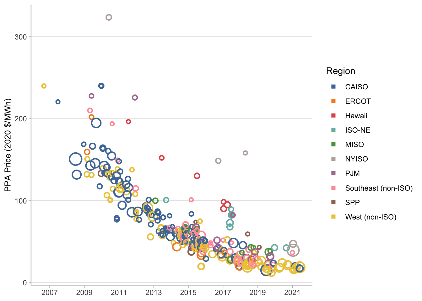
Bubble Chart in GGplot2
Create the Tableau color palette for the plot. You can technically use the tableau color scales from ggthemes, but I noticed the colors were in a weird order on the dashboard? I just decided to use the hex codes so I could be sure that they would map to the right regions.
color.pal <- c(
  "#4E79A7", #dark blue
  "#F28E2B", #orange
  "#E15759", #red
  "#76B7B2", #teal
  "#59A14F", #green
  "#BAB0AC", #gray
  "#B07AA1", #purple
  "#FF9DA7", #pink
  "#9C755F", #brown
  "#EDC948" #yellow
  )
Now use ggplot to make the bubble chart. Normally it probably wouldn’t take so much formatting, but I wanted to try and get as close to the Tableau dashboard as possible. I’m not really going to bother with the legend here because I’m going to combine the charts into one plot later on and I’m not going to use this legend.
p1 <- ppa_price_long %>%
  ggplot(aes(x = ppa_execution_date,
             y = price,
             size = capacity_mw,
             color = region))+
  geom_point(shape = 1, stroke = 1.2)+
  scale_size(guide = "none")+
  scale_color_manual(values = color.pal, name = "Region")+
  #ggthemes::scale_color_tableau()+
  scale_x_date(date_breaks = "2 years", date_labels = "%Y")+
  ylab("PPA Price (2020 $/MWh)")+
  theme_light()+
  theme(panel.grid.major.x = element_blank(),
        panel.grid.minor.x = element_blank(),
        panel.grid.minor.y = element_blank(),
        panel.border = element_blank(),
        axis.line.x.bottom = element_line(color = "lightgray"),
        axis.line.y.left = element_line(color = "lightgray"),
        axis.title.y = element_text(size = 10),
        axis.title.x = element_blank())+
  guides(color = guide_legend(
    override.aes=list(shape = 15)))

p1
Stacked Bar in GGplot2
This first chunk of code is to create the aggregation by year that will be used for the numbers on the very top of the bar. There are other ways to do this, you could use annotate() for example, but I thought this was a nice hack. Basically I’m going to sum by year, but I’m going to keep the region that corresponds to the top bar on the chart. Then I join it to the dataset I’m using for the stacked bar plot so each year only has one total and the rest of the rows have NA totals. That way I can use geom_text and it will actually look nice.
year_totals <- ppa_price_long %>%
  group_by(ppa_year) %>%
  arrange(ppa_year, region) %>%
  summarise(year_total = prettyNum(trunc(sum(capacity_mw)),
                                   big.mark = ","),
            region = first(region))
I’m doing the aggregation by region and year as part of this code right before the ggplot starts, and left joined the year totals on as I mentioned above. Adding the label argument as part of the aes() in the overall ggplot makes it really easy to use geom_text when you have multiple plot layers. The rest of this formatting, again, is really just to try and match the Tableau dashboard. Looks pretty good so far.
p2 <- ppa_price_long %>%
  group_by(region, ppa_year) %>%
  summarise(capacity_mw = sum(capacity_mw)) %>%
  left_join(year_totals) %>%
  ggplot(aes(x = ppa_year,
             y = capacity_mw,
             color = region,
             fill = region,
             label = year_total))+
  geom_col(width = 0.7)+
  geom_text(position = position_stack(), vjust = -0.5, size = 3) +
  scale_fill_manual(values = color.pal)+
  scale_color_manual(values = color.pal)+
  scale_x_continuous(breaks = seq(2006, 2021, 1))+
  scale_y_continuous(limits = c(0, 3500),
                     expand = c(0,0),
                     labels = c("0K", "1K", "2K", "3K"),
                     breaks = c(0, 1000, 2000, 3000))+
  ylab("Capacity (MW-AC)")+
  theme_light()+
  theme(legend.position = "top",
        axis.title.y = element_text(size = 10),
        panel.grid.major.x = element_blank(),
        panel.grid.minor.x = element_blank(),
        panel.grid.minor.y = element_blank(),
        panel.border = element_blank(),
        axis.line.x.bottom = element_line(color = "lightgray"),
        axis.line.y.left = element_line(color = "lightgray"),
        axis.title.x = element_blank(),
        axis.text.x = element_text(angle = 90))
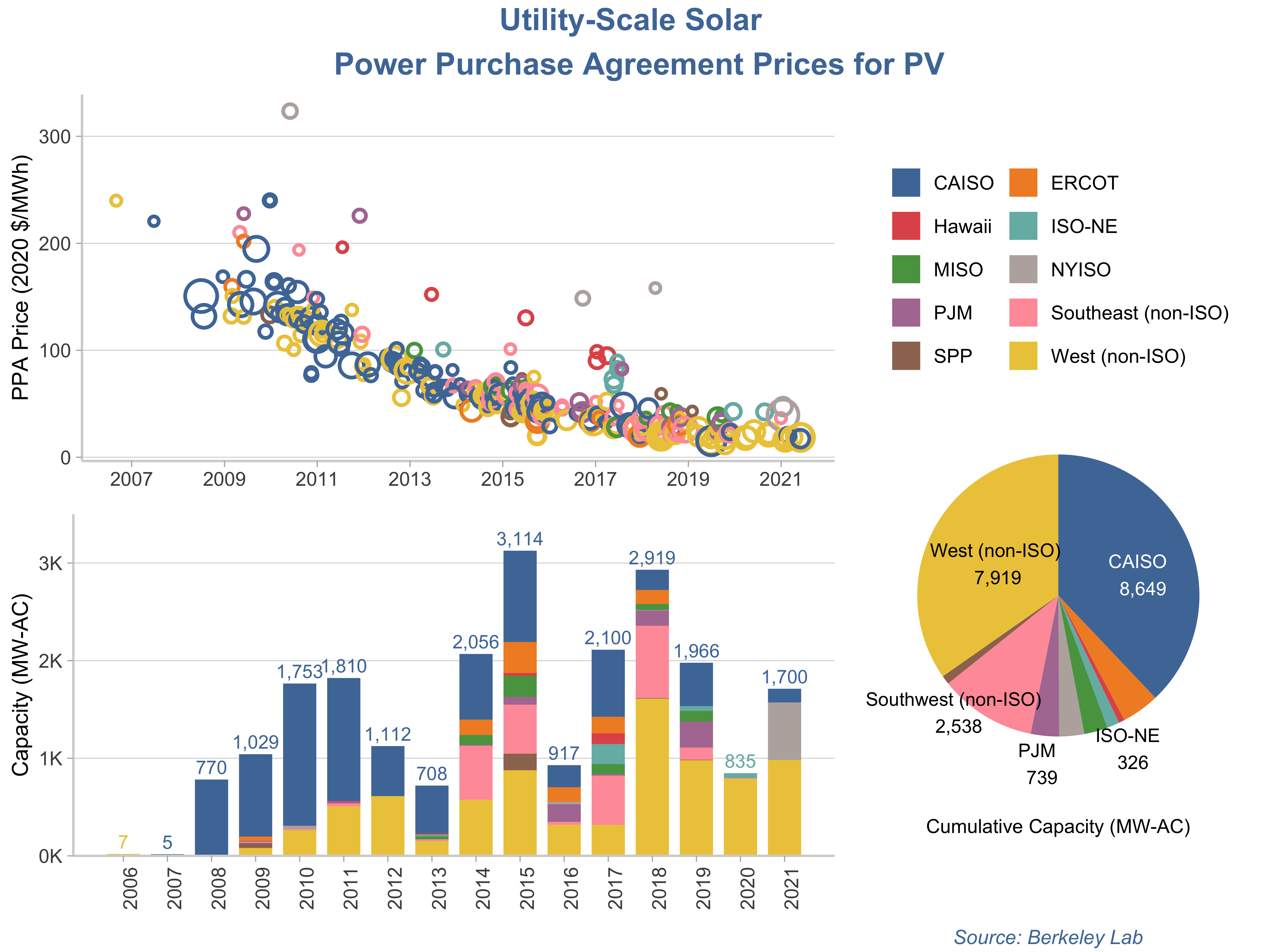
Pie Chart in GGplot2
At first I wasn’t going to do a pie chart, because they are not really ideal and especially not with so many categories. But then I realized it would be a good way to use this plot for the legend when I arrange them all together. Plus it looks more like the dashboard.
To create a pie chart in ggplot2 you basically have to create a single stacked bar and then force it to polar coordinates. So here’s the aggregation code I’m going to base the plot on.
cumulative_cap <- ppa_price_long %>%
  group_by(region) %>%
  summarise(cumulative_capacity = round(sum(capacity_mw))) %>%
  mutate(capacity_label = prettyNum(cumulative_capacity, big.mark = ","))
The really tricky part is to add labels, and I’m not going to do that for all of the regions since they are not shown on the dashboard either. I ended up deciding to use annotate instead just to show those five specific regions. Also note that I’m using the direction argument in coord_polar(), all that does is flip the slices the opposite way, which I needed to match the dashboard.
p3 <- ggplot(cumulative_cap,
             aes(x="",
                 y=cumulative_capacity,
                 fill=region))+
  geom_bar(stat="identity", width=1)+
  scale_fill_manual(values = color.pal)+
  coord_polar("y", start=0, direction = -1)+
  annotate("text", y = 4000, x = 1,
           label = "West (non-ISO)\n 7,919", size = 3)+
  annotate("text", y = 18000, x = 1.1,
           label = "CAISO \n 8,649", color = "white", size = 3)+
  annotate("text", y = 8800, x = 1.6,
           label = "Southwest (non-ISO) \n 2,538", size = 3)+
  annotate("text", y = 13000, x = 1.7,
           label = "ISO-NE \n 326", size = 3)+
  annotate("text", y = 11000, x = 1.7,
           label = "PJM \n 739", size = 3)+
  theme_void()+
  labs(caption = "Cumulative Capacity (MW-AC)")+
  theme(legend.position="top",
        legend.title = element_blank(),
        legend.key.size = unit(.5, 'cm'),
        plot.caption = element_text(hjust = .5),
        plot.title = element_text(hjust = 0.5, size = 12),
        plot.subtitle = element_text(hjust = 0.5, size = 10))+
  guides(fill = guide_legend(nrow = 5, byrow = TRUE))
Arranging the Plots
Now I’m going to use the ggarrange() function from ggpubr to put these all together. What’s happening here is I’m basically using nested ggarranges so that I can put the bubble and bar charts together first, and then have the pie chart + legend in its own column that spans both of those rows.
p_full <- ggarrange(
  ggarrange(p1, p2, nrow=2, legend = "none"),
  p3,
  widths = c(2, 1), heights = c(1,1))
## Warning: Removed 59 rows containing missing values (geom_text).
annotate_figure(p_full,
               top = text_grob(
                 "Utility-Scale Solar \n Power Purchase Agreement Prices for PV",
                 face = "bold",
                 size = 14,
                 color = color.pal[1]),
               bottom = text_grob(
                 "Source: Berkeley Lab",
                 hjust = 1,
                 x = .9,
                 face = "italic",
                 size = 9,
                 color = color.pal[1])
)
The only thing missing from this is, of course, the interactivity. I could have used Plotly to accomplish that, or even created the ggplots first and then converted them to Plotly. I will add the interactive Plotly charts I created using Python to the end of this post.
Interactive Bubble Chart from Python Plotly
Interactive Bar Chart from Python Plotly
- Posted on:
- May 6, 2022
- Length:
- 12 minute read, 2421 words
- Categories:
- Analytics X3 TidyTuesday
- See Also: