Tidy Tuesday: New York Times Bestsellers
By Katie Press in TidyTuesday
May 11, 2022
This week’s data is on New York Times Bestseller Lists. I love books so I was pretty interested in this data! I am using the nyt_full.tsv dataset from the Tidy Tuesday repo. I also created some supplemental data to use in this post, which you can download here on Kaggle.
nyt_full <- readr::read_tsv('https://raw.githubusercontent.com/rfordatascience/tidytuesday/master/data/2022/2022-05-10/nyt_full.tsv', show_col_types = FALSE)
color.pal1 <- c("#34516F",  "#4E79A7", "#A0CBE8", #blue
                "#C0660C" , "#F28E2B", "#FFBE7D", #oranges
                "#3C6D36", "#59A14F", "#8CD17D", #green
                "#B6992D", "#F1CE63", #brown and yellow
                "#2E605E", "#499894", "#86BCB6", #sea green
                "#AD1F21" , "#E15759", "#FF9D9A", #pinks
                "#79706E", "#BAB0AC", #silvers
                "#D37295", "#FABFD2", #pinks
                "#B07AA1", "#D4A6C8", #purple
                "#9D7660", "#D7B5A6" #browns
                )
Longest Active Authors on the NYT Bestseller List
Data Cleaning and Aggregation
Just looking at the number of books per author, there is some cleaning to do here. A few titles start with a question mark or exclamation point and “by”.
count(nyt_full, author) %>% head()
## # A tibble: 6 × 2
##   author                    n
##   <chr>                 <int>
## 1 ! by Fannie Flagg        11
## 2 ! by Jackie Collins       6
## 3 ! by Terry Brooks         2
## 4 ! by Terry Pratchett      2
## 5 ! by W. E. B. Griffin     5
## 6 ? by Isabel Bolton        1
String Manipulation
Get rid of those unwanted characters using stringr package with regular expressions. Make sure to include the white space in the string so it doesn’t end up with leading white spaces.
nyt_full <- nyt_full %>%
  mutate(author = str_remove(author, "! by |\\? by "))
I might want to do some analysis by decade, we already have the years. Using lubridate functions for this. The “year” will format as a 4-digit year, otherwise by just using floor_date we would get 1930-01-01. Which would probably be fine, except it’s not going to be that great for visualization.
nyt_full <- nyt_full %>%
  mutate(decade = year(floor_date(week, years(10))))
Also converting the title to title case.
nyt_full <- nyt_full %>%
  mutate(title = str_to_title(title))
Check to see if any of the authors are listed more than once in a week. Some do, but it looks like they are for different books. So I will count weeks once per author per book.
nyt_full %>%
  get_dupes(author, week) %>%
  head()
## # A tibble: 6 × 8
##   author           week       dupe_count  year  rank title_id title       decade
##   <chr>            <date>          <int> <dbl> <dbl>    <dbl> <chr>        <dbl>
## 1 Charlaine Harris 2009-10-25          2  2009     2      261 A Touch Of…   2000
## 2 Charlaine Harris 2009-10-25          2  2009    15     1323 Dead And G…   2000
## 3 Charlaine Harris 2009-11-15          2  2009     9     2045 Grave Secr…   2000
## 4 Charlaine Harris 2009-11-15          2  2009    15      261 A Touch Of…   2000
## 5 Dan Brown        2004-01-18          2  2004     1     4918 The Da Vin…   2000
## 6 Dan Brown        2004-01-18          2  2004    14      462 Angels & D…   2000
I noticed that some of the authors have books they collaborated on with others. For example, Terry Pratchet has quite a few books and only one of them has a co-author. I will split these into a separate column so that I can count the weeks or books per first author.
nyt_full %>%
  filter(str_detect(author, "Terry Pra"))
## # A tibble: 9 × 7
##    year week        rank title_id title                  author           decade
##   <dbl> <date>     <dbl>    <dbl> <chr>                  <chr>             <dbl>
## 1  2005 2005-10-02     4     6847 Thud                   Terry Pratchett    2000
## 2  2005 2005-10-09    15     6847 Thud                   Terry Pratchett    2000
## 3  2007 2007-10-07     4     2885 Making Money           Terry Pratchett    2000
## 4  2007 2007-10-14    10     2885 Making Money           Terry Pratchett    2000
## 5  2009 2009-10-25    13     6589 The Unseen Academicals Terry Pratchett    2000
## 6  2011 2011-10-30     3     4176 Snuff                  Terry Pratchett    2010
## 7  2012 2012-07-08    13     5688 The Long Earth         Terry Pratchett…   2010
## 8  2014 2014-04-06     2     3712 Raising Steam          Terry Pratchett    2010
## 9  2014 2014-04-13    13     3712 Raising Steam          Terry Pratchett    2010
This is a good reason to use str_split_fixed, which returns a character matrix. All I’m doing here is creating a column for the first author and telling it to put in the first item in the matrix, and same for author2 and the second matrix item.
nyt_full <- nyt_full %>%
  mutate(author1 = str_split_fixed(author, " and ", n = 2)[,1],
         author2 = str_split_fixed(author, " and ", n = 2)[,2])
Calculate Time Active by Author
Get the first and last week per author, not per book. Then calculate the number of years active.
nyt_full <- nyt_full %>%
  group_by(author1) %>%
  mutate(first_week = min(week),
         last_week = max(week)) %>%
  mutate(total_author_years = round(time_length(first_week %--% last_week, "years"), 2))
I’m going to focus on the top 25 longest active authors. I can use slice_max() from dplyr to do this quickly and easily. I am going to exclude the author “Anonymous” because it probably represents several different authors.
author_long <- nyt_full %>%
  ungroup() %>%
  filter(author1 != "Anonymous") %>%
  distinct(author1, first_week, last_week, total_author_years) %>%
  slice_max(total_author_years, n = 25, with_ties = FALSE)
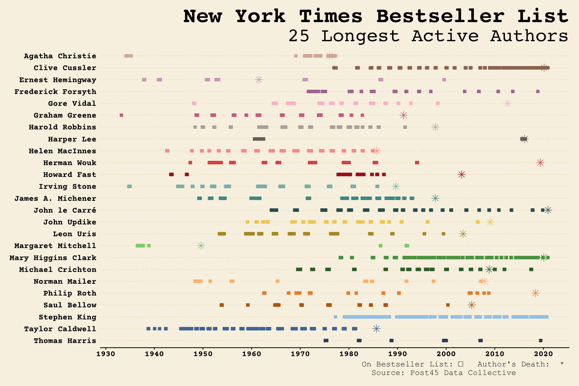
Looks like Ernest Hemingway is the winner for longest-active author on the NYT best seller list.
head(author_long)
## # A tibble: 6 × 4
##   author1           first_week last_week  total_author_years
##   <chr>             <date>     <date>                  <dbl>
## 1 Ernest Hemingway  1937-10-25 1999-08-15               61.8
## 2 Norman Mailer     1948-05-23 2007-02-25               58.8
## 3 John le Carré     1964-01-19 2019-11-10               55.8
## 4 Harper Lee        1960-08-07 2016-04-10               55.7
## 5 Margaret Mitchell 1936-07-06 1992-01-19               55.5
## 6 Irving Stone      1934-10-08 1985-12-01               51.2
Author Death Dates
I thought it would be interesting to look at the authors’ dates of death (most of them are no longer alive) to see how many were on the bestseller list after they died.
date_df <- tribble(~author1, ~death_date,
                   "Ernest Hemingway", "1961-07-02",
                   "Norman Mailer", "2007-11-10",
                   "John le Carré", "2020-12-12",
                   "Harper Lee", "2016-02-19",
                   "Margaret Mitchell", "1949-08-11",
                   "Irving Stone", "1989-08-26",
                   "Gore Vidal", "2012-07-31",
                   "Graham Greene", "1991-04-03",
                   "Michael Crichton", "2008-11-04",
                   "John Updike", "2009-01-27",
                   "Frederick Forsyth", "",
                   "Herman Wouk", "2019-05-17",
                   "Saul Bellow", "2005-04-05",
                   "Philip Roth", "2018-05-22",
                   "Leon Uris", "2003-06-21",
                   "Thomas Harris", "",
                   "Clive Cussler", "2020-02-24",
                   "James A. Michener", "1997-10-16",
                   "Howard Fast", "2003-03-12",
                   "Stephen King", "",
                   "Harold Robbins", "1997-10-14",
                   "Agatha Christie", "1976-01-12",
                   "Mary Higgins Clark", "2020-01-31",
                   "Taylor Caldwell", "1985-08-30",
                   "Helen MacInnes", "1985-09-30"
                   ) %>%
  mutate(death_date = ymd(death_date))
Join the death dates and the rest of the weeks back onto the author_long data. Creating a new column for author status and book status, I’m not sure which one I’ll use yet.
author_full <- author_long %>%
  left_join(date_df) %>%
  left_join(nyt_full) %>%
  mutate(author_status = ifelse(week <= death_date | is.na(death_date), "Alive", "Dead")) %>%
  group_by(author1, title) %>%
  mutate(book_status = ifelse(week == min(week), "New Bestseller!", "Current Bestseller")) %>%
  ungroup()
Some More Data Cleaning for Charts
Creating a vector of dates to serve as the x-axis for the plot (going by decades). Convert the author1 to a factor for ordering in charts. Also reversing the author factor because I want to have the author names in alphabetical order starting at the top of the y axis.
date.vec <- seq(ymd("1930-01-01"), ymd("2020-01-01"), by = "10 years")

author_full <- author_full %>%
  mutate(Author = fct_rev(factor(author1)))

date_df <- date_df %>%
  mutate(Author = fct_rev(factor(author1)))
Final Longest Listed Authors GGplot
Now for the plot, I’m using two different datsets so I need to specify the dataframe and aes() in each geom instead of in the overall ggplot(). Selecting the columns is just so I can rename them quickly and easily so they look good in the resulting tooltip (in the plotly version). I’m mapping the title to label and book status to group - this will not affect the ggplot chart, but these will show up in the tooltip when it’s converted using ggplotly. The Courier Prime font is from Google fonts.
p1 <- ggplot()+
  geom_point(data = author_full %>%
               select("Week" = week,
                      Author,
                      "Title" = title,
                      "Book Status" = book_status),
             aes(x = Week,
                 y = Author,
                 color = Author,
                 label = Title,
                 group = `Book Status`),
             shape = "square",
             size = 2
             )+
  geom_point(data = date_df %>%
               select(Author, "Date of Death" = death_date),
             aes(x = `Date of Death`, y = Author, color = Author),
             shape = "asterisk",
             size = 3.5
             )+
  scale_color_manual(values = color.pal1)+
  scale_y_discrete(limits = levels(date_df$Author))+
  scale_x_date(breaks = date.vec, date_labels = "%Y")+
  labs(title = "New York Times Bestseller List",
       subtitle = "25 Longest Active Authors",
       caption = "On Bestseller List: □   Author's Death:  * \n Source: Post45 Data Collective           ")+
  theme_wsj()+
  theme(legend.position = "none",
        axis.title = element_blank(),
        panel.grid.minor.x = element_blank(),
        panel.grid.major.y = element_line(size = .5, color = "#F0DAA8"),
        axis.text.y = element_text(family = "Courier Prime"),
        axis.text.x = element_text(family = "Courier Prime"),
        plot.caption = element_text(size = 12, family = "Courier New"),
        plot.title = element_text(hjust = 1, size = 32),
        plot.subtitle = element_text(hjust = 1, size = 28))

p1
Final Interactive Longest Authors Plot
To turn this into an interactive plot with Plotly, all I have to do is use ggplotly(). This apparently removes titles and subtitles though, so I had to re-add them using the plotly layout(). Unfortunately the custom Olde English font is not showing up in the resulting html document, even though it shows up in the preview window of the knitted RMD. I also had to add an annotation to replace the caption from the ggplot chart.
ggplotly(p1, tooltip = c("x", "y", "label", "group")) %>%
  layout(
    title = list(
      "text" = paste0(
        "New York Times Bestseller List",
        '<br>',
        '<sup>',
        "Longest Active Authors"
      ),
      font = list(family = "Courier Prime",
                  size = 24)
    ),
    annotations = list(
      x = 1,
      y = -0.08,
      text = "On Bestseller List: □   Author's Death:  *",
      xref = 'paper',
      yref = 'paper',
      xanchor = 'right',
      yanchor = 'auto',
      showarrow = FALSE,
      font = list(size = 12, family = "Courier New")
    )
  )
Bestselling Books by Decade
I recently saw a ggplot2 extension called ggpage and thought it looked cool, and since this data is all about books, I figured this would be a great time to use it.
Data Aggregation
First calculate the number of weeks on the bestseller list by title.
author_full <- author_full %>%
  group_by(author1, title) %>%
  mutate(first_title_date = min(week),
         last_title_date = max(week)) %>%
  mutate(title_weeks_total = time_length(first_title_date %--% last_title_date, "weeks")) %>%
  ungroup()
I will probably do this by decade, and some of these books have been popular in multiple decades. Gone With the Wind is of course the prime example. I think I’ll start with trying the all time weeks total and selecting the decade in which the title was originally published.
author_full %>%
  distinct(author1, title, title_weeks_total, decade) %>%
  group_by(decade) %>%
  arrange(decade, desc(title_weeks_total)) %>%
  slice(1)
## # A tibble: 10 × 4
## # Groups:   decade [10]
##    author1           title                  decade title_weeks_total
##    <chr>             <chr>                   <dbl>             <dbl>
##  1 Margaret Mitchell Gone With The Wind       1930             2898.
##  2 Norman Mailer     The Naked And The Dead   1940               61
##  3 Herman Wouk       The Caine Mutiny         1950              127
##  4 Harper Lee        To Kill A Mockingbird    1960               97
##  5 Stephen King      The Stand                1970              628
##  6 Margaret Mitchell Gone With The Wind       1980             2898.
##  7 Margaret Mitchell Gone With The Wind       1990             2898.
##  8 Thomas Harris     Hannibal                 2000               28
##  9 Harper Lee        Go Set A Watchman        2010               36
## 10 Stephen King      The Institute            2020               22
That’s not exactly what I want, because I need more variety so I don’t want to have Gone with the Wind on there three times. What about longest per decade?
author_full <- author_full %>%
  group_by(author1, title, decade) %>%
  mutate(first_title_date_d = min(week),
         last_title_date_d = max(week)) %>%
  mutate(title_weeks_total_decade = time_length(first_title_date_d %--% last_title_date_d, "weeks")) %>%
  ungroup()
That looks better.
plot_df <- author_full %>%
  distinct(author1, title, title_weeks_total_decade, decade) %>%
  group_by(decade) %>%
  arrange(decade, desc(title_weeks_total_decade)) %>%
  slice(1)

plot_df
## # A tibble: 10 × 4
## # Groups:   decade [10]
##    author1           title                    decade title_weeks_total_decade
##    <chr>             <chr>                     <dbl>                    <dbl>
##  1 Margaret Mitchell Gone With The Wind         1930                      124
##  2 Norman Mailer     The Naked And The Dead     1940                       61
##  3 Herman Wouk       The Caine Mutiny           1950                      127
##  4 Harper Lee        To Kill A Mockingbird      1960                       97
##  5 Leon Uris         Trinity                    1970                       76
##  6 James A. Michener The Covenant               1980                       42
##  7 Stephen King      The Stand                  1990                       38
##  8 Philip Roth       The Plot Against America   2000                       17
##  9 Harper Lee        Go Set A Watchman          2010                       36
## 10 Stephen King      If It Bleeds               2020                       18
Plotting with ggpage
Read in the book summary data (linked from Kaggle earlier). To create this dataset, I just copied and pasted them into this Excel since I’m only using 10 books it was just easier that way. So we have one row per book, and the summary text is in a single column.
book_summary <- read_excel("book_summary.xlsx")

head(book_summary)
## # A tibble: 6 × 4
##   title                  book_no decade text
##   <chr>                    <dbl>  <dbl> <chr>
## 1 Gone With The Wind           1   1930 "Gone with the Wind, novel by Margaret …
## 2 The Naked And The Dead       2   1940 "Hailed as one of the finest novels to …
## 3 The Caine Mutiny             3   1950 "Winner of the Pulitzer Prize and a per…
## 4 To Kill A Mockingbird        4   1960 "Harper Lee's Pulitzer Prize-winning ma…
## 5 Trinity                      5   1970 "The \"terrible beauty\" that is Irelan…
## 6 The Covenant                 6   1980 "James A. Michener’s masterly chronicle…
Luckily, ggpage has a function to break up the text into lines for us. Now there are multiple rows per book (there should be 104 rows total).
book_summary <- book_summary %>%
  group_by(book_no) %>%
  nest_paragraphs(., text)

head(book_summary)
##                                                                                text
## 1     Gone with the Wind, novel by Margaret Mitchell, published in 1936. \\It won a
## 2   Pulitzer Prize in 1937. \\Gone with the Wind is a sweeping romantic story about
## 3 the American Civil War from the point of view of the Confederacy. \\In particular
## 4  it is the story of Scarlett O’Hara, a headstrong Southern belle who survives the
## 5     hardships of the war and afterward manages to establish a successful business
## 6   by capitalizing on the struggle to rebuild the South. \\Throughout the book she
##                title book_no decade
## 1 Gone With The Wind       1   1930
## 2 Gone With The Wind       1   1930
## 3 Gone With The Wind       1   1930
## 4 Gone With The Wind       1   1930
## 5 Gone With The Wind       1   1930
## 6 Gone With The Wind       1   1930
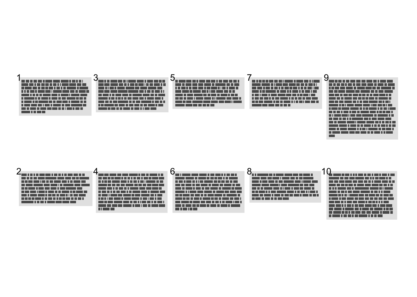
This took me a minute to figure out. I wanted to group the text by book, so that each little page is from one book. At first, it was not doing that at all. Then I saw there is a page.col specification, and I tried to use the “title” column for that and it didn’t work. I finally realized that whatever column you use for this just needs to be numeric, so I just assigned them 1-10 by decade (e.g., 1= 1930). I’m also telling it to create 5 columns, that way I can have two rows of five books/decades each.
book_par <- book_summary %>%
  ggpage_build(page.col = "book_no", ncol = 5)
Check out the first plot - everything looks to be in order and separated correctly by book. I guess I would have preferred to have 1-5 going across the top row and 6-10 across the bottom, but it doesn’t bother me enough to mess around with this more.
book_par %>%
  ggpage_plot(paper.show = TRUE, page.number = "top-left")
Sentiment Analysis Prep
Now I want to do sentiment analysis. These can be read in from the Tidytext package. The NRC sentiment dataset has 10 different sentiments:
nrc_df <- get_sentiments(lexicon = "nrc")

count(nrc_df, sentiment)
## # A tibble: 10 × 2
##    sentiment        n
##    <chr>        <int>
##  1 anger         1246
##  2 anticipation   837
##  3 disgust       1056
##  4 fear          1474
##  5 joy            687
##  6 negative      3318
##  7 positive      2308
##  8 sadness       1187
##  9 surprise       532
## 10 trust         1230
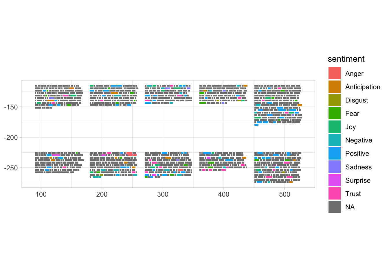
The only thing is, I know from prior experience that some words are connected to more than one sentiment. I don’t want that because I was planning on mapping the sentiments to colors. So to be fair, I’ll group by word and then choose a random sentiment so that I don’t pick them in alphabetical order.
nrc_slim <- nrc_df %>%
  group_by(word) %>%
  sample_n(1) %>%
  ungroup()
Join the sentiments onto the book paragraph dataset.
book_par <- book_par %>%
  left_join(nrc_slim) %>%
  mutate(sentiment = str_to_title(sentiment))
Now try plotting again. This time, each word is assigned to a color. The words that weren’t matched to sentiments are gray, so the colored sentiment words really stand out. This looks pretty cool, so I will move on to styling the plot.
Note: I knew I wanted to use annotations to label the books, but I wasn’t sure what was going on with the plot area, axes, etc. So I just tried out adding a ggplot theme to it, and that allowed me to see what the x and y axis scales were.
book_par %>%
  ggpage_plot(ggplot2::aes(fill = sentiment, label = word))+
  theme_light()
Some more formatting for plots
#color palette for sentiments
color.pal2 <- c("#E15759", #anger (red)
                "#F28E2B", #anticipation (orange)
                "#B6992D", #disgust (brownish yellow)
                "#59A14F", #fear (green)
                "#F1CE63", #joy (yellow)
                "#499894", #negative (teal blue)
                "#D37295", #positive (dark pink)

                "#4E79A7", #sadness (blue)
                "#B07AA1", #surprise (purple)
                "#D4A6C8", #(light pink)

                #"#F0DAA8"
                "#BAB0AC"
                )


#this will help make the legend nicer and get rid of the gray NA square
sent.chars <- book_par %>%
  filter(!is.na(sentiment)) %>%
  distinct(sentiment) %>%
  arrange(sentiment) %>%
  pull(sentiment)

#making a tibble to use for the annotations, creating a label
title_df <- book_summary %>%
  left_join(author_full %>% distinct(author, title)) %>%
  mutate(label = paste0(decade, "s",  "\n", title, "\n", author)) %>%
  distinct(title, label)

#assigning the x and y coordinates
## I just eyeballed it and then made some adjustments.
title_df <- title_df %>%
  mutate(x = c(125, 125,
               218, 218,
               305, 305,
               397, 397,
               487, 487),
         y = c(rep(c(-90, -200), 5)))
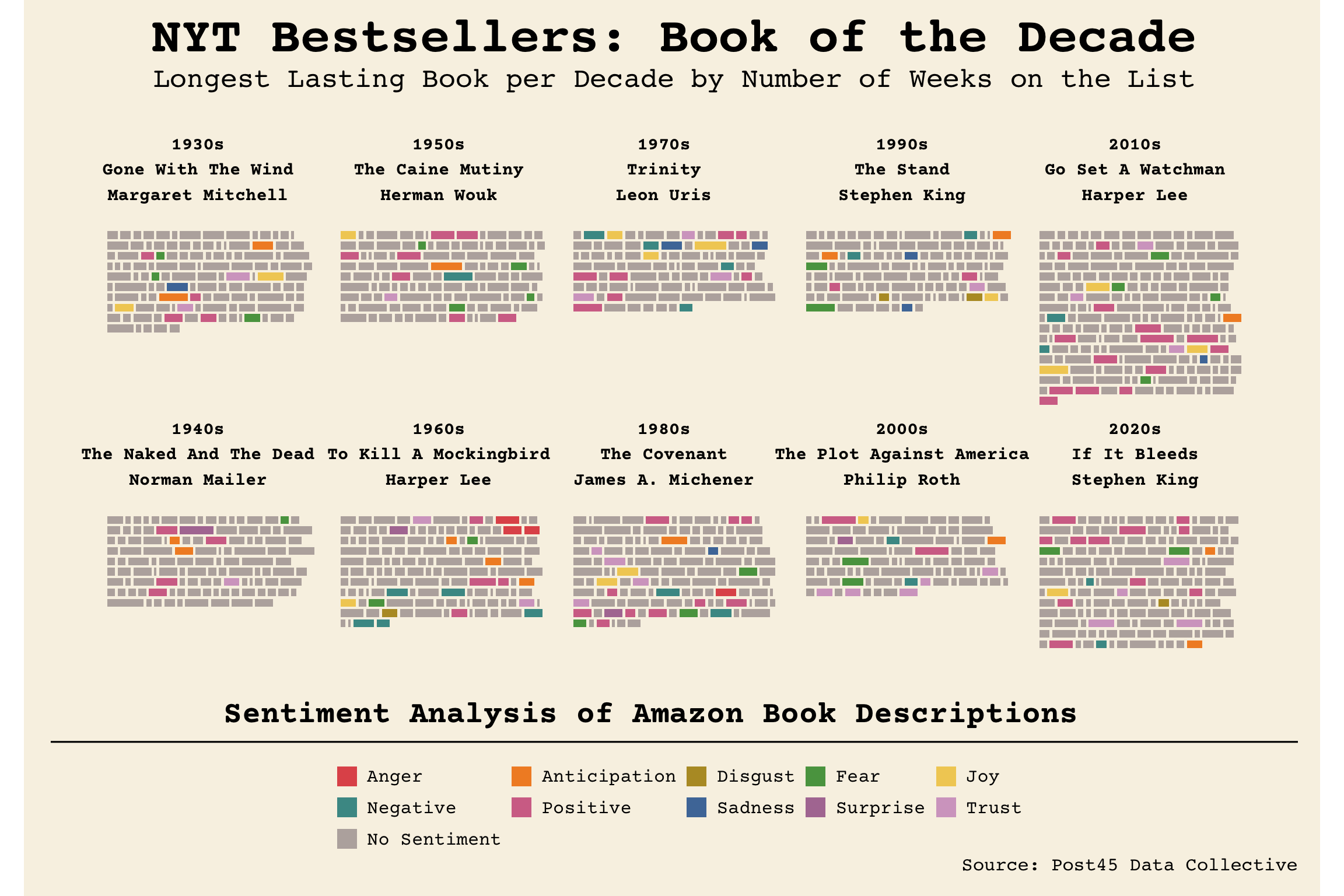
Final Books by Decade Plot
It took a lot of formatting, but the end result looks pretty good!
p2 <- book_par %>%
  #mutate(sentiment = factor(sentiment)) %>%
  mutate(sentiment = fct_explicit_na(factor(sentiment), na_level = "No Sentiment")) %>%
  ggpage_plot(ggplot2::aes(fill = sentiment, label = word)) +
  scale_y_continuous(limits = c(-300,-75)) +
  scale_fill_manual(values = color.pal2#, breaks = sent.chars
                    )+
  annotate(
    "text",
    x = title_df$x,
    y = title_df$y,
    label = title_df$label,
    size = 4,
    family = "Courier Prime",
    fontface = "bold"
  ) +
  annotate(
    "text",
    x = 300,
    y = -300,
    label = "Sentiment Analysis of Amazon Book Descriptions",
    family = "Courier Prime",
    size = 7,
    fontface = "bold"
  ) +
  labs(title = "NYT Bestsellers: Book of the Decade",
       subtitle = "Longest Lasting Book per Decade by Number of Weeks on the List",
       caption = "Source: Post45 Data Collective") +
  theme_wsj() +
  theme(
    legend.position = "bottom",
    legend.key.size = unit(.5, "cm"),
    legend.box.margin = margin(0, 0, 0, 0),
    legend.margin = margin(0, 0, 0, 0),
    legend.text = element_text(size = 12, family = "Courier Prime"),
    legend.title = element_blank(),
    plot.title = element_text(size = 32, hjust = 0.5),
    plot.subtitle = element_text(size = 18, hjust = 0.5),
    plot.caption = element_text(size = 12),
    panel.grid.major = element_blank(),
    axis.text.x = element_blank(),
    axis.text.y = element_blank(),
    axis.ticks.x = element_blank()
  ) +
  guides(fill = guide_legend(nrow = 3, ncol = 5, byrow = T))

p2
Final Books by Decade Interactive Plot
Now since I included the label in the aes(), I can feed this ggplot into ggplotly as well. Then you should be able to hover over each “word” and see what the actual word was. I’m getting a message that the horizontal legend is not supported yet, which I didn’t think was true, or maybe it’s only for ggplotly? In any case, at least the interactivity is there.
ggplotly(p2) %>%
  layout(
    title = list(
      "text" = paste0(
        "NYT Bestsellers: Book of the Decade",
        '<br>',
        '<sup>',
        "Longest Lasting Book per Decade by Number of Weeks on the List"
      ),
      font = list(family = "Courier Prime",
                  size = 24)
    ),

    legend = list(
      x = 0,
      xanchor = 'left',
      yanchor = 'bottom',
      orientation = 'h',
      font = list(size = 14),
      title = list(text = "")
    )
  )
I could probably do some more formatting for the ggplotly chart but it’s close enough for now.