Trust No One
By Katie Press in Projects XFiles
January 3, 2021
In the last two episodes, I created an X-Files episode dataset and web-scraped episode scripts. Now it’s time for some real text analysis. Most of this is going to be based on Julia Silge’s work on tidy text mining, which can be found in her free eBook. And of course, all of this is based on the principles of tidy data - see this paper by tidyverse author Hadley Wickham for more details.
Tidy Text Data
Basically, tidy data is set up so that each variable is in its own column, each observation of said variable has its own row, and these combine to make a table. This is sometimes referred to as “long” data. The tidytext packages has lots of helpful functions for manipuating and analyzing text data in a tidy way. I much prefer this to using a corpus because I can use all of the tidyverse functions I usually use.
The first thing I’m going to do to create a tidy dataset is to use the function unnest_tokens so that I can have one word on every line. If you guessed that this will make the dataset huge, you are correct. But that’s okay, because it’s in long format and long format data is generally faster and easier to work with from a system/memory standpoint. However, I will get rid of a couple of extra columns I know I don’t need.
ep_words <- ep_text %>%
  mutate(line_no = row_number()) %>%
  select(-description, -prod_code, -text, -directed_by, -written_by) %>%
  unnest_tokens(., "word", line) %>%
  mutate(word = str_to_lower(word))
Now there will be some words that I don’t want to use that would just clutter up any analysis I try to do. These are mostly filler words like “the”, “and”, “if”. Thankfully tidytext has a built-in dataset of these words, called stop_words. I can use anti_join to get rid of all the stop words from my dataset. This cuts it down by about a third, so there were quite a lot of them!
ep_words <- anti_join(ep_words, stop_words)
## Joining, by = "word"
The most common word is Mulder, which makes sense. But Scully is fifth, behind phone, agent, and “yeah”.
Sentiment Analysis
The tidytext package provides four different sentiment datasets. One is numeric, one is divided into negative/positive, and the last two a sentiment to each word, such as “fear” or “trust”.
afinn <- get_sentiments("afinn")
bing <- get_sentiments("bing")
nrc <- get_sentiments("nrc")
lran <- get_sentiments("loughran")

main.characters <- c("Scully", "Mulder", "Cigarette Smoking Man", "X", "Skinner",
                     "Frohike", "Byers", "Langly")
Using inner_join so that only the words that exist in both datasets will be included, I can look at the sentiments of the main characters. Overall, the text does have a negative tone for all speakers. It looks like Frohike is winnning the positivity contest by a landslide though, which checks out.
tb1 <- ep_words %>%
  filter(speaker %in% main.characters) %>%
  inner_join(bing) %>%
  group_by(speaker) %>%
  count(sentiment) %>%
  arrange(speaker, sentiment) %>%
  mutate(n = scales::percent(n/sum(n))) %>%
  spread(sentiment, n)
I’m interested to see what the nrc and loughran sentiment datasets look like for the main characters as well. It looks like there are 10 sentiments in the nrc dataset, and only 6 in the loughran dataset. Of those 6, I realized that most of the words in my dataset fall into the “negative” category, which makes it pretty much unusable for my purposes.
NRC Words
LRAN Words
When I join the nrc dataset, it looks like more than one sentiment can be tied to each word, which is interesting.
nrc_main <- ep_words %>%
  filter(speaker %in% main.characters) %>%
  inner_join(nrc) %>%
  select(season, speaker, word, sentiment)
## Joining, by = "word"
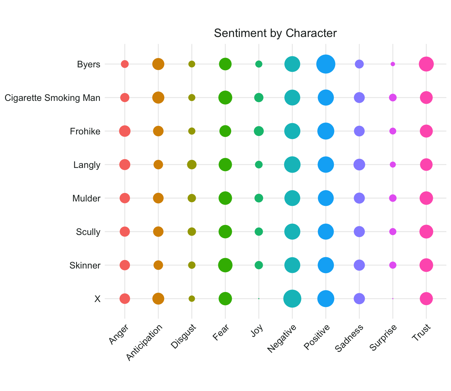
Let’s compare the sentiments of the main speakers. Apparently X is never surprised or joyful, and it looks like Byers is the most trusting … again, that checks out.
my_theme3 <- theme(legend.position = "none",
        plot.title = element_text(family = "Arial", size = 14, color = "#232928", hjust = .5),
        axis.title = element_blank(),
        axis.text.y = element_text(family = "Arial", size = 11, color = "#232928"),
        axis.text.x = element_text(family = "Arial", size = 11, color = "#232928", angle = 45, hjust = 1)
        )
nrc_main %>%
  count(speaker, sentiment) %>%
  group_by(speaker) %>%
  mutate(n = n/sum(n),
         sentiment =str_to_title(sentiment)) %>%
  ggplot(aes(x = sentiment, y = fct_rev(speaker)))+
  geom_count(aes(size = n, group = speaker, color = sentiment),show.legend = FALSE) +
  scale_size(range = c(0,10)) +
  coord_fixed() +
  theme_minimal()+
  my_theme3 +
  ggtitle("Sentiment by Character")
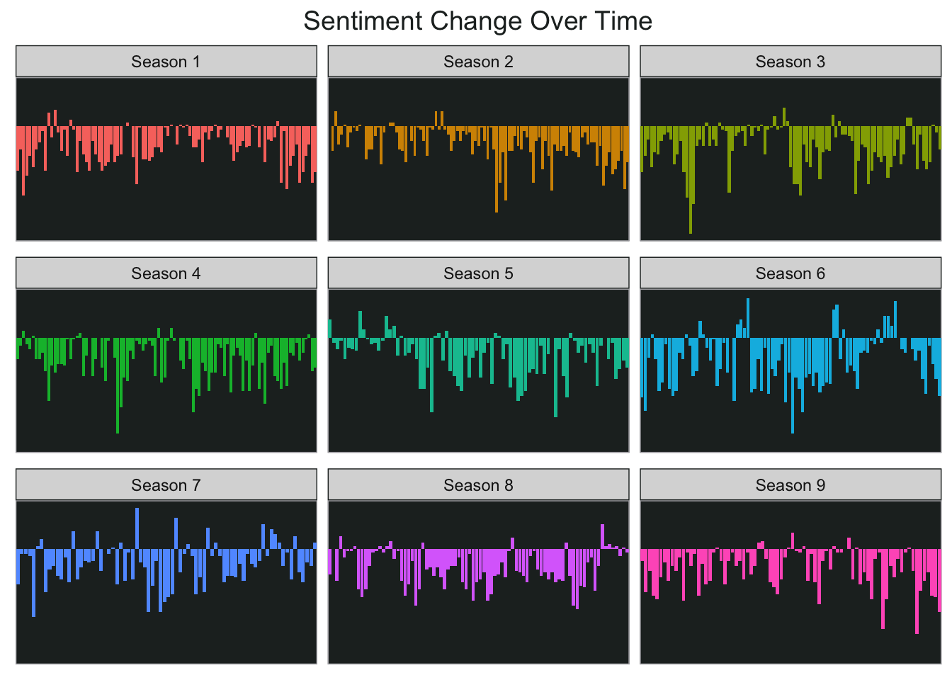
I’m also interested in looking at sentiment by season and/or episode, and I think I’ll use the numeric sentiments for this. The afinn dataset categorizes words from -5 (most negative sentiment) to 5 (most positive sentiment). I’m going to create a dataset of all words from ep_words that match to afinn. I’m basically going to chunk the episodes within each season and produce the overall sentiment for each chunk so that I can chart it. First divide every episode into four equal portions, this can sort of represent 15 minute chunks of each episode.
season_sent <- ep_words %>%
  inner_join(afinn) %>%
  group_by(no_overall) %>%
  mutate(line_no2 = data.table::rleid(line_no))  %>%
  group_by(no_overall) %>%
  mutate(index = cut(line_no2, 4, include.lowest = TRUE, labels = c(1, 2,3,4))) %>%
  group_by(season, no_overall, index) %>%
  summarise(sentiment = sum(value)) %>%
  mutate(final_index = paste0(no_overall, index))
## Joining, by = "word"
## `summarise()` has grouped output by 'season', 'no_overall'. You can override
## using the `.groups` argument.
As you can see below, most of Mulder and Scully’s time investigating the X-Files was not exactly positive…but there were still some good moments.
ggplot(season_sent, aes(final_index, sentiment, fill = season)) +
  geom_col(show.legend = FALSE) +
  facet_wrap(~season, ncol = 3, scales = "free_x") +
  my_theme2 +
  theme(axis.text.y = element_blank(),
        axis.ticks.y = element_blank(),
        axis.title.x = element_blank())+
  ggtitle("Sentiment Change Over Time")
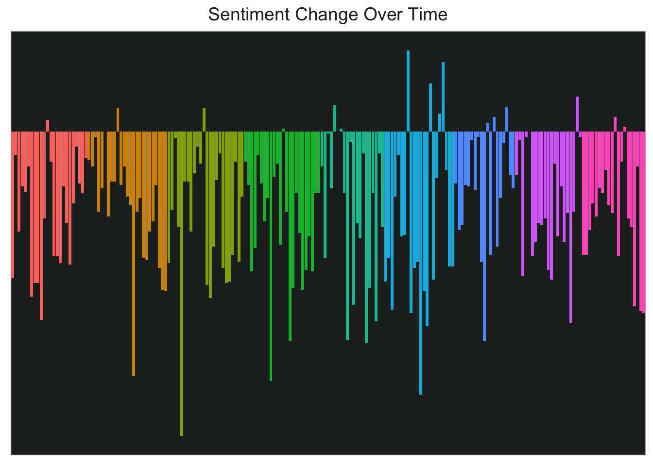
I think this would look pretty cool in a single chart too so let’s try that next.
final_sent <- ep_words %>%
  inner_join(afinn) %>%
  mutate(line_no2 = data.table::rleid(line_no))  %>%
  group_by(season, no_inseason) %>%
  summarise(sentiment = sum(value)) %>%
  ungroup() %>%
  mutate(final_index = as.factor(row_number())) %>%
  ungroup()
ggplot(final_sent, aes(final_index, sentiment,fill=season)) +
  geom_col(show.legend = FALSE) +
  my_theme2 +
  theme(axis.text.y = element_blank(),
        axis.ticks.y = element_blank(),
        axis.title.x = element_blank())+
  ggtitle("Sentiment Change Over Time")
That’s all for now…next time might be topic modeling.