Tidy Tuesday: Tuskegee Airmen
By Katie Press in TidyTuesday
February 13, 2022
knitr::opts_chunk$set(echo = TRUE,message=FALSE,warning=FALSE)
library(tidyverse)
library(usmap)
library(emojifont)
library(showtext)
Data
I geocoded as many of the records as I could - some of the hometowns and/or states were incorrect and had to be cleaned up. I uploaded this file to Kaggle as well.
airmen <- readRDS("/Users/katiepress/Desktop/Rproj/Tuskeegee/airmen.RDS")
Colors and Fonts for Styling the Map
cadet.light <- "#386F81"
blood.red <- "#780e0d"
alabaster <- "#F2F0E3"
field.drab <- "#645B40"
cadet <- "#4d6673"
medal.yellow <-  "#E3A95D"
gunmetal <- "#172a33"

font_add_google(name = "Yesteryear", family = "yesteryear")
font_add_google(name = "Dynalight", family = "dynalight")
font_add(family = "chuterolk", regular = "./Users/katiepress/Downloads/ChuterolkFreeRegular-L3R55.ttf")
Count of Airmen per Hometown and State
This information will be used for the state colors and the point overlays. I’m also adding the fontawesome icon I want to use instead of points for my cities. This can be done using the emojifont package, and I’m storing that in a column called “label”.
city_counts <- count(airmen, new_city, new_state, "lon" = longitude,
                     "lat" = latitude) %>%
  filter(!is.na(lon)) %>%
  select(lon, lat , everything())

city_counts <- city_counts %>%
  filter(!new_state %in% c("HT", "HAITI", "UNK", "VI"))

city_counts <- city_counts %>%
  arrange(desc(lon)) %>%
  slice(8:362)

city_counts <- city_counts %>%
  mutate(label = fontawesome('fa-fighter-jet'))

city_counts <- city_counts %>%
  mutate(count_group = factor(case_when(n < 6 ~ "1-5",
                                 between(n, 6, 10) ~ "6-10",
                                 between(n, 11, 20) ~ "11-20",
                                 n > 20 ~ "20+"), levels = c("1-5", "6-10", "11-20", "20+")))

city_counts <- city_counts %>% filter(new_state != "TD")

cities_t <- usmap_transform(city_counts)

state_counts <- count(airmen %>% filter(new_state %in% state.abb), new_state)


state_counts <- state_counts %>%
  mutate(count_group = factor(case_when(n <11 ~ "1-10",
                                 between(n, 11, 25) ~ "11-25",
                                 between(n, 26, 50) ~ "26-50",
                                 n > 50 ~ "50+"),
                              levels = c("1-10", "11-25", "26-50", "50+")))
Creating the Map
I’m using the usmap package for the base plot, which is actually a ggplot2 format I believe, just a shortcut way of doing things. First, get some map info and join the state counts from earlier. Important note here - apparently to use this information in your map, you can only have two columns and one of them has to be a fips code or state.
usa_map <- usmap::us_map(regions = "states") %>%
  left_join(state_counts %>% select("abbr" =  new_state, count_group)) %>%
  select(fips, count_group)
Now plot the base map, excluding Alaska and Hawaii since there are no airmen from those states anyways. I’m adding a geom_text layer here with a fontawesome icon of a fighter jet - this is from the emojifont package. Here I’m assigning colors to the states based on a discrete variable, which is not usually best practice for count data. However, I’m going for a certain style here that is inspired by WEB DuBois maps:
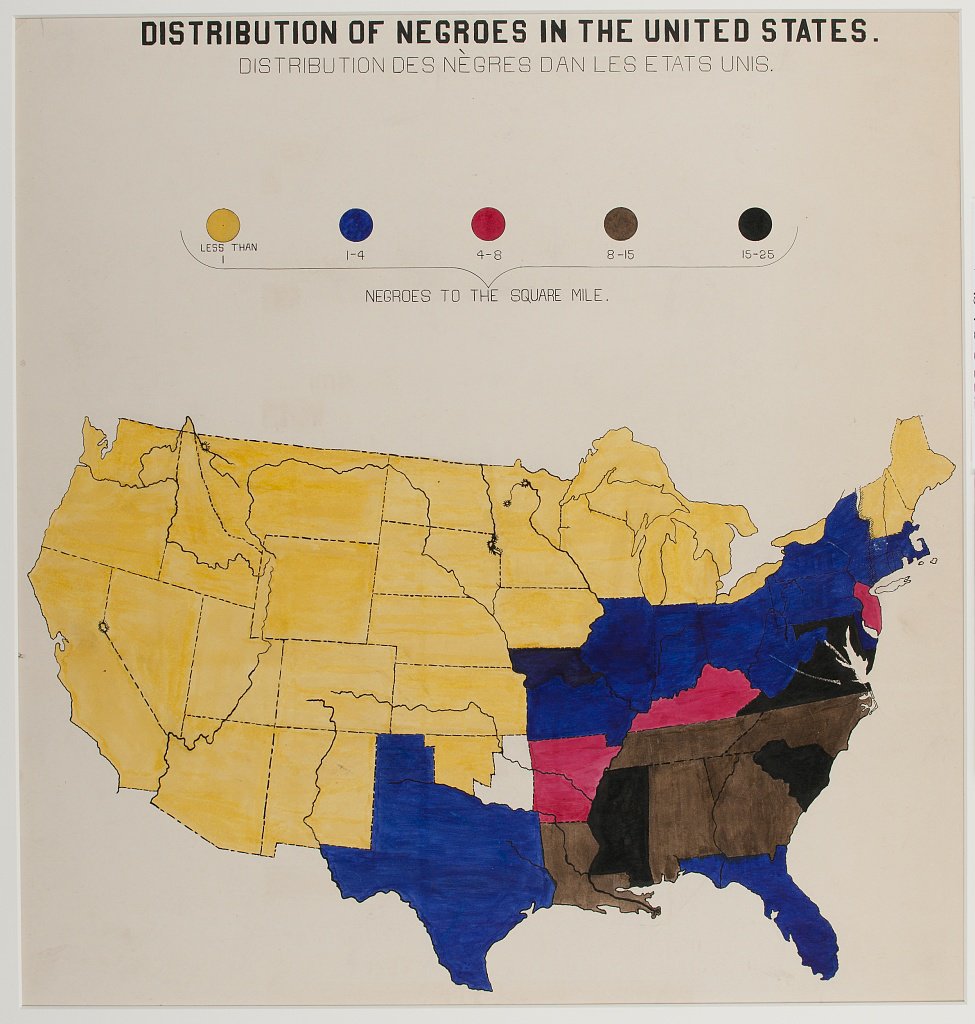
I was also inspired by this vintage-style poster

The size of the fighter jet icon will also correspond to the number of airmen from that particular city. I was having a terrible time trying to format the legend for this, until I realized that I had the label inside the aesthetic. As soon as I took it out everything worked perfectly.
state_map <- plot_usmap(
    regions = "state",
    exclude = c("Alaska", "Hawaii"),
    data = usa_map,
    values = "count_group"
  ) +
  geom_text(
    data = cities_t,
    aes(x = lon.1, y = lat.1, size = count_group),
    label = fontawesome('fa-fighter-jet'),
    color = alabaster,
    family = 'fontawesome-webfont'
  )  +
  scale_fill_manual(
    name = "Airmen per State",
    values = c(field.drab, "#203A46", blood.red, medal.yellow),
    na.value = "#DADABE"
  ) +
  scale_size_manual(name = "Airmen per Hometown", values = c(5, 7, 9, 11)) +
  labs(
    title = "The",
    subtitle = "TUSKEGEE AIRMEN",
    caption = str_c("Red Tails 1941-1949")
  )
Finalize the Map
It took a lot of code to format since I used several different fonts and I’m pretty picky about how my visualizations look in general. I was pretty satisfied with the result, EXCEPT for the fact that I could not get it to look the same when I tried printing it inline in this Rmarkdown document, or saving with ggsave(). This is one of the things that annoys me about ggplot. In any case, I was able to save the PNG to my desktop and I will leave the code here and just upload the photo of the chart. If you want to print it out inline, I’ve used fig.height=6, fig.width=6, dev=‘png’, dpi=300 in the setup for this chunk.
plot +
  guides(
    size = guide_legend(title.position = "top", title.hjust = .5),
    fill = guide_legend(title.position = "top", title.hjust = .5)
  ) +
  theme(
    legend.position = "bottom",
    legend.text = element_text(
      family = "chuterolk",
      size = 28,
      color = alabaster
    ),
    legend.title = element_text(
      family = "chuterolk",
      size = 32,
      color = alabaster
    ),
    legend.background = element_rect(fill = cadet.light, color = cadet.light),
    panel.background = element_rect(fill = cadet.light, color = cadet.light),
    legend.key = element_rect(fill = NA),
    plot.background = element_rect(fill = cadet.light, color = cadet.light),
    plot.title = element_text(
      family = "dynalight",
      color = alabaster,
      size = 40,
      hjust = .4,
      vjust = -0.1
    ),
    plot.subtitle = element_text(
      family = "chuterolk",
      color = alabaster,
      size = 60,
      hjust = .5
    ),
    plot.caption = element_text(
      family = "yesteryear",
      color = blood.red,
      size = 40,
      vjust = 54,
      hjust = .5
    ),
    legend.key.size = unit(1, 'cm'),
    legend.spacing = unit(2.2, 'inches'),
    legend.margin = margin(0, 0, 0, 20)
  )

- Posted on:
- February 13, 2022
- Length:
- 4 minute read, 842 words
- Categories:
- TidyTuesday
- Tags:
- Maps
- See Also:
- Tidy Tuesday: Drought Conditions